Role:
Sole Product Designer
(with mentorship)
Context:
5 day design sprint
Summary:
Bedtime story tablet app for parents
The Problem:
Families struggle to choose a bedtime story.
The Solution:
A place where choosing a stories is easy, fun and effortless.
Design Sprint
Quick Prompt Rundown
Parents often pick a handful of books for children to choose.
Parents choose based on genre and topic.
Choosing a book for multiple children of different reading levels is a struggle.
Many parents use tablets to read to their children.
Day 1: Map
User Flow
Ideal end-to-end experience a user might have with my product
I chose this project because the issue is impactful and I wanted to learn tablet design.
Day 2: Research
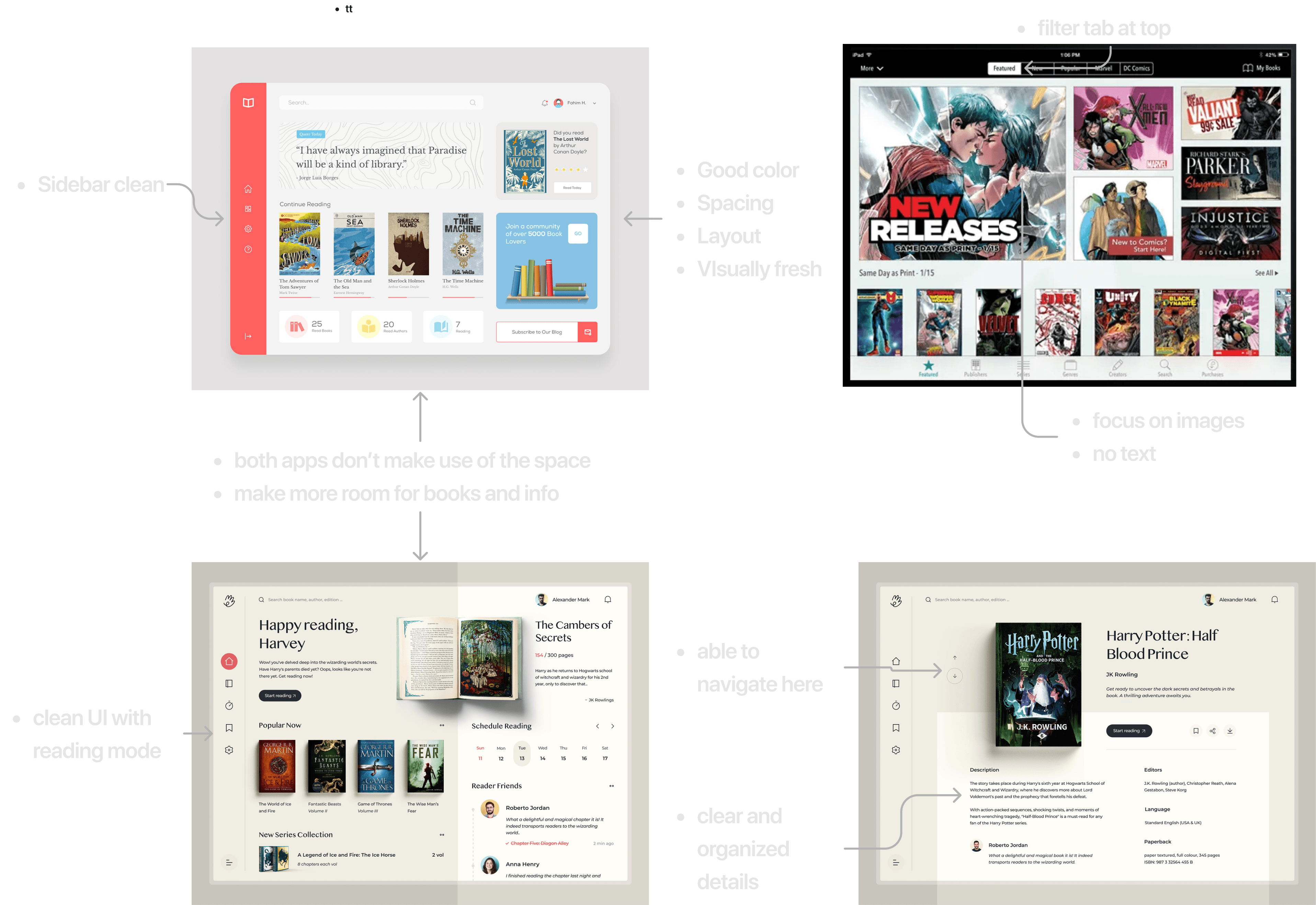
Competitive Analysis
Learning and drawing inspiration from existing products in the space
I learned valuable visual patterns from researching existing reading app on tablet.

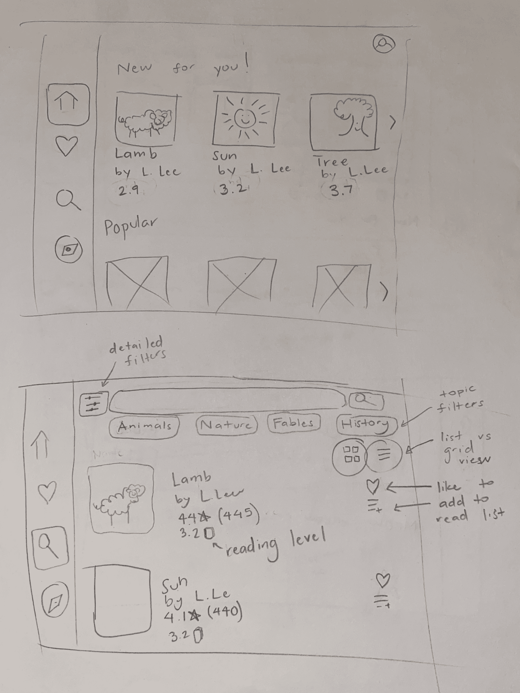
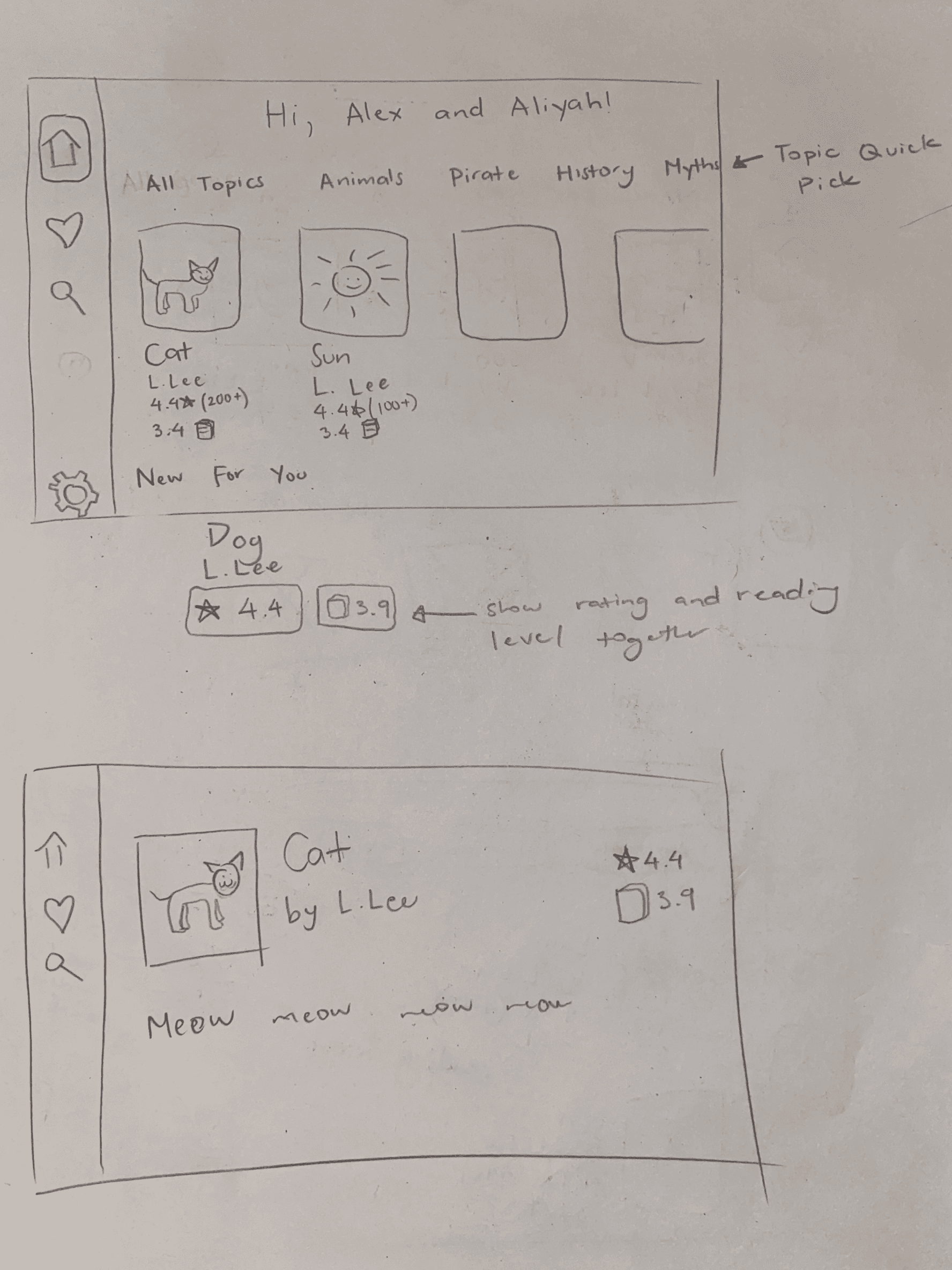
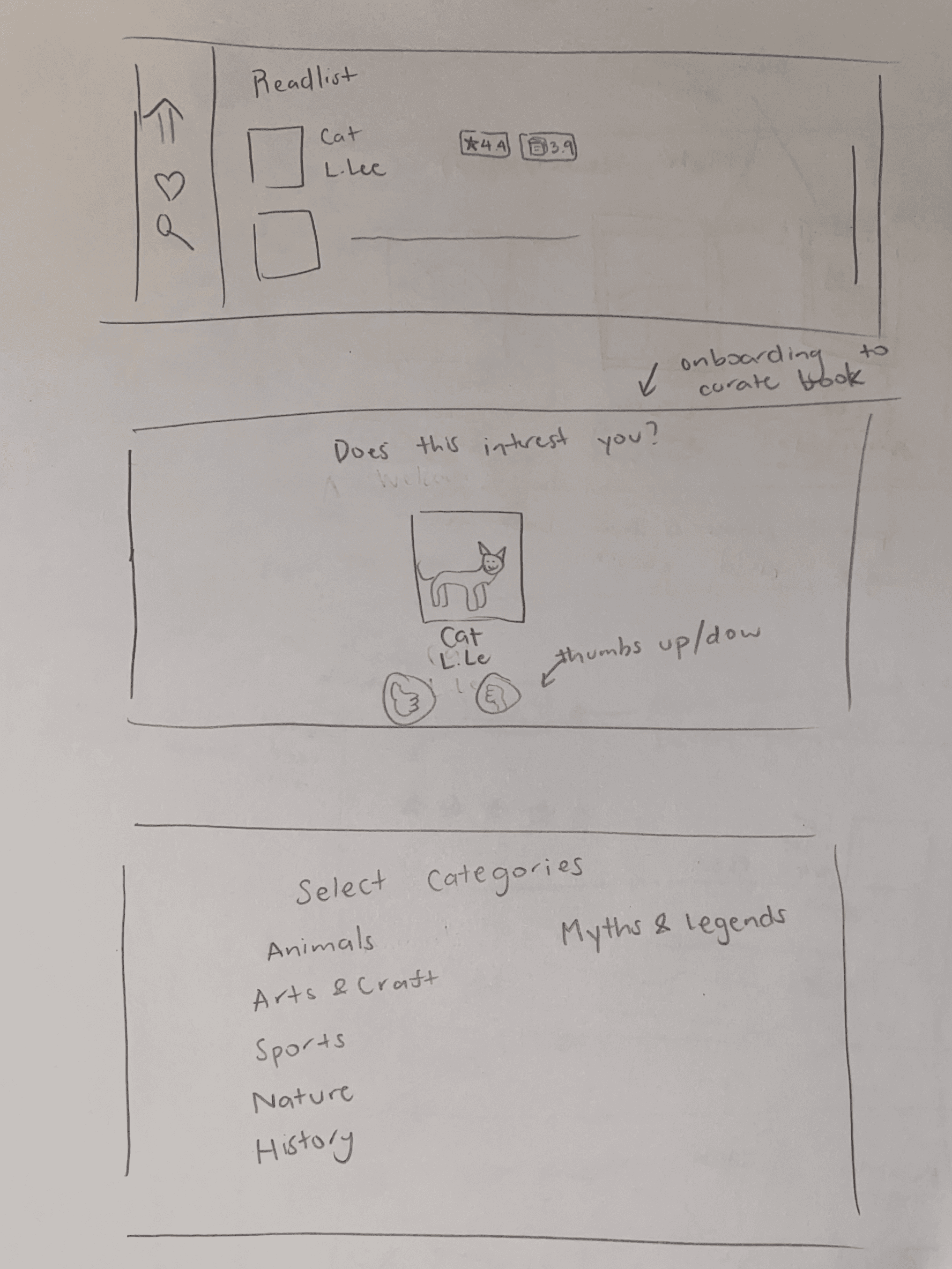
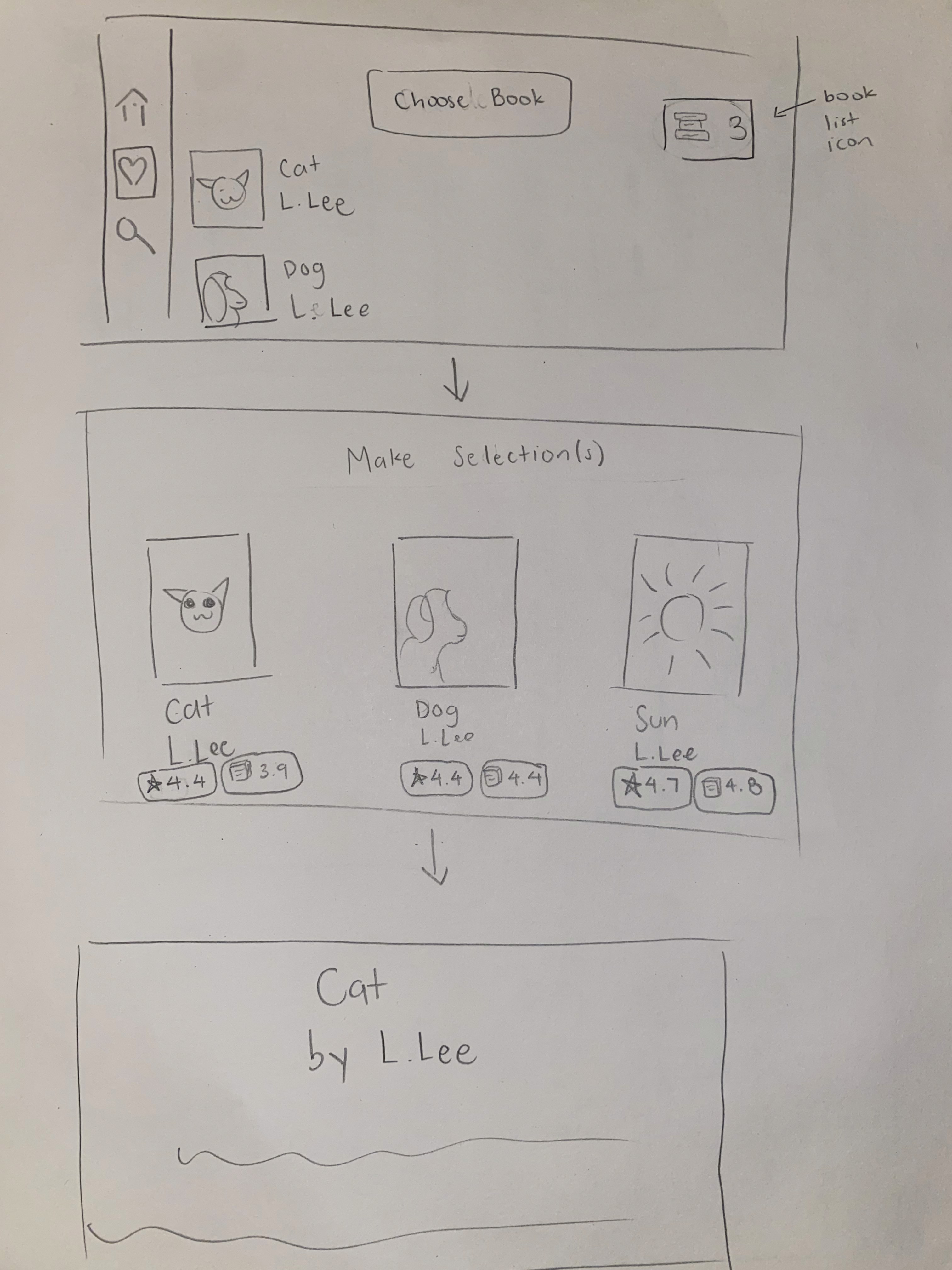
Day 3: Sketches
Homepage (top) and Search (bottom)
Homepage (top) and Details (bottom)
Readlist (top) and Onboarding (middle and bottom)
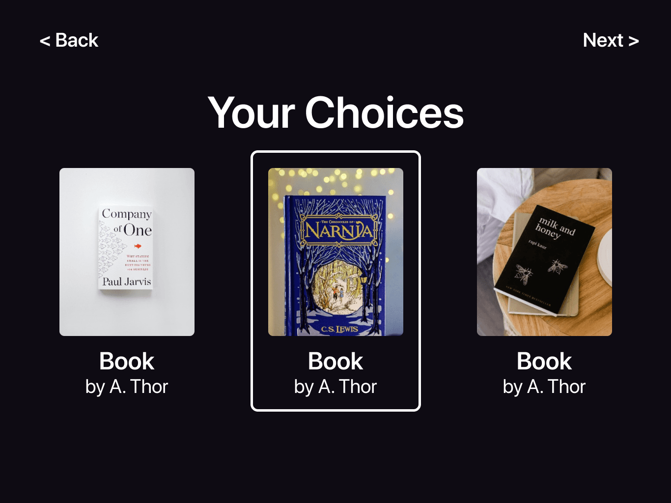
Choosing a book flow
Sketching further refined the direction of the product.
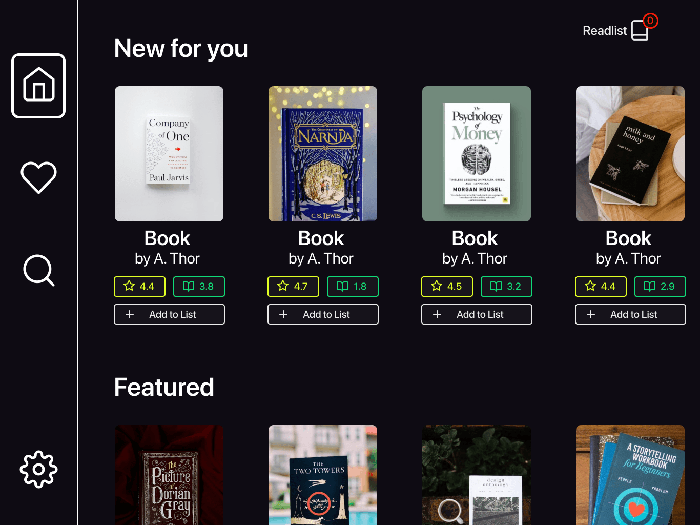
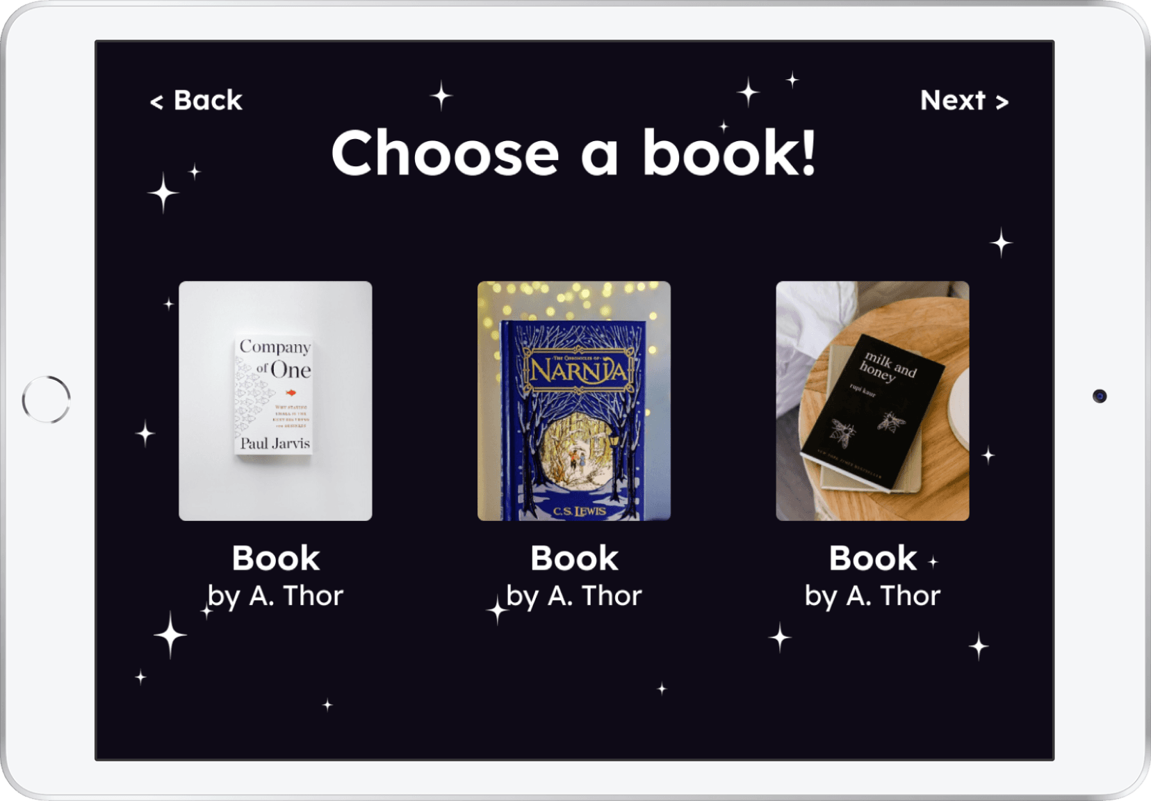
Day 4: Prototype
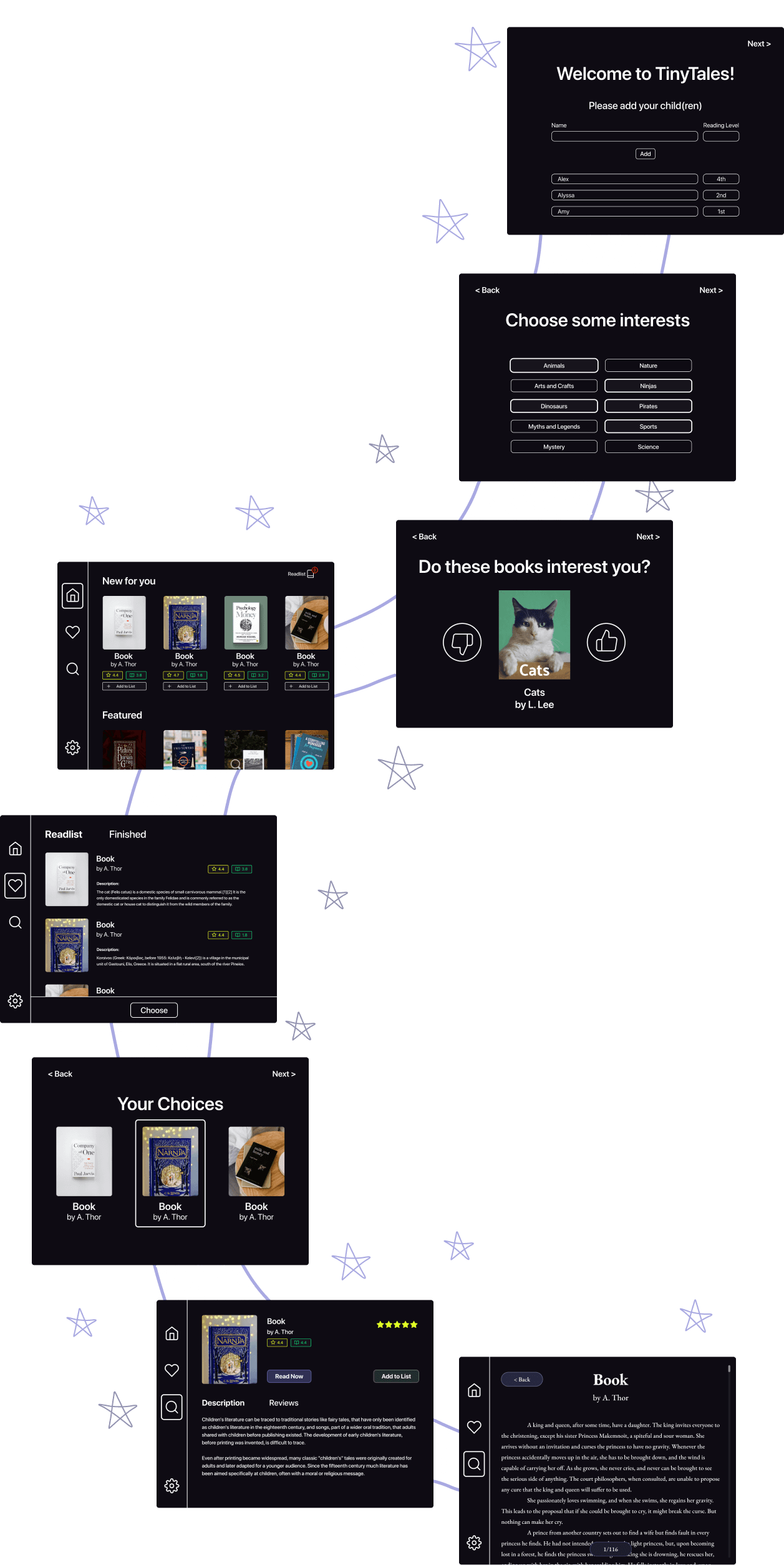
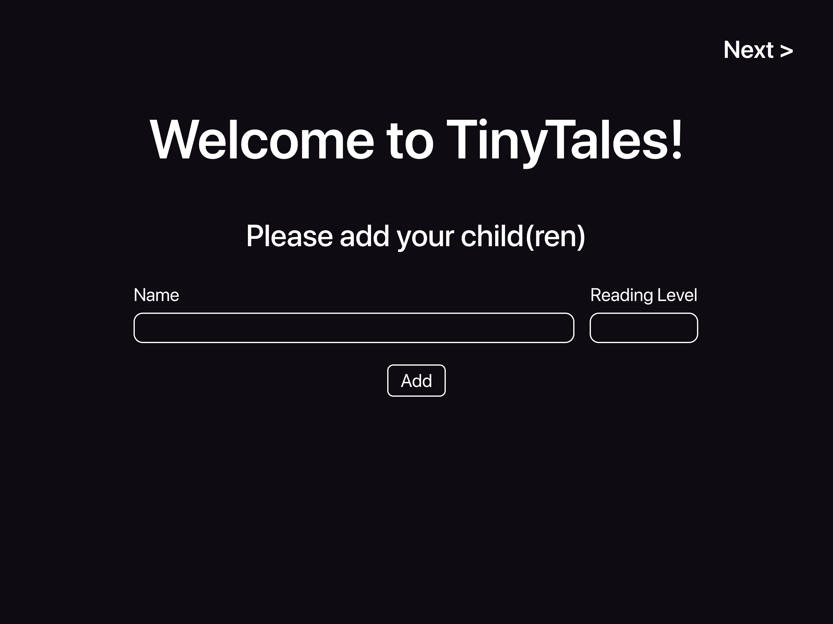
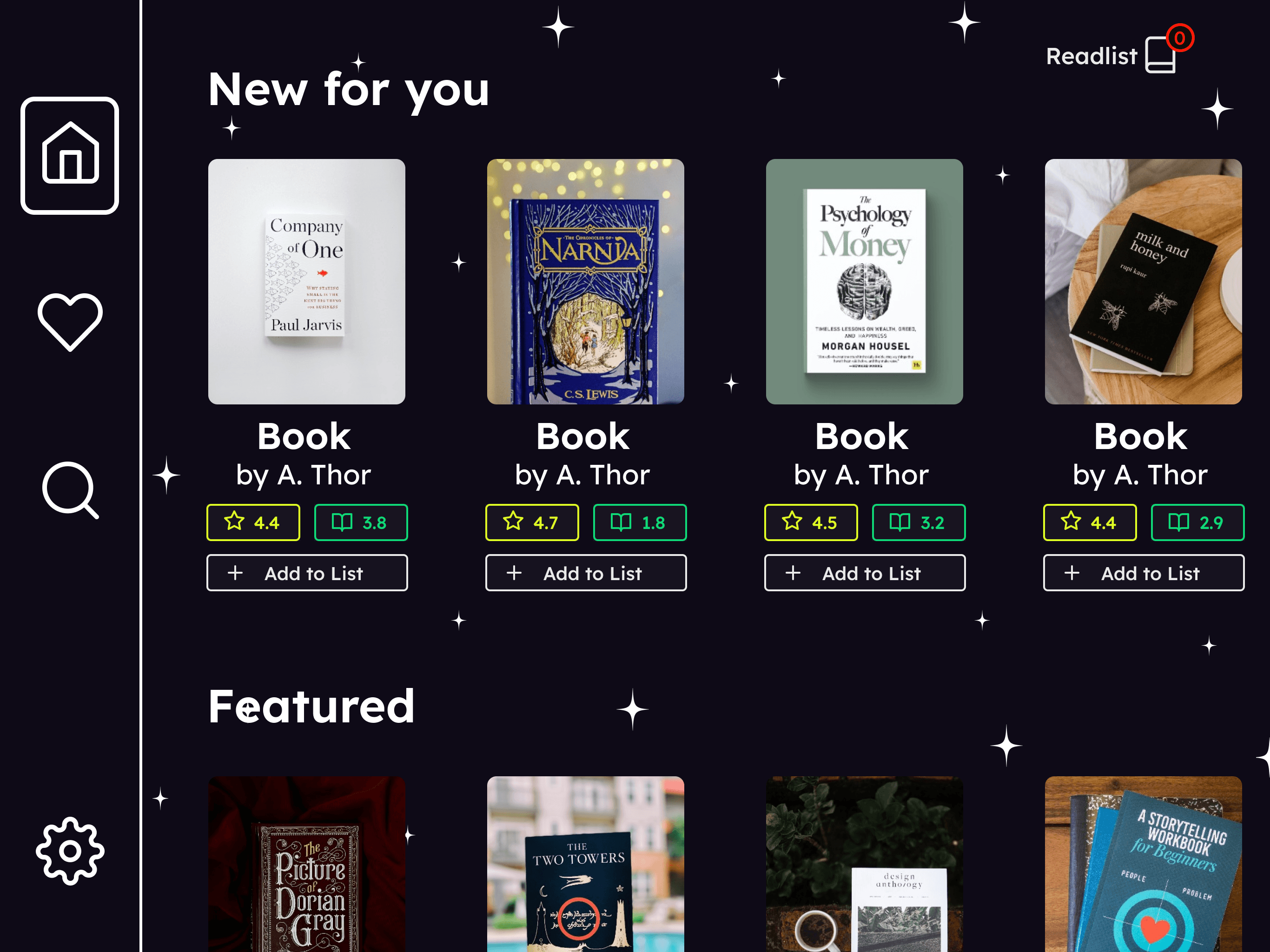
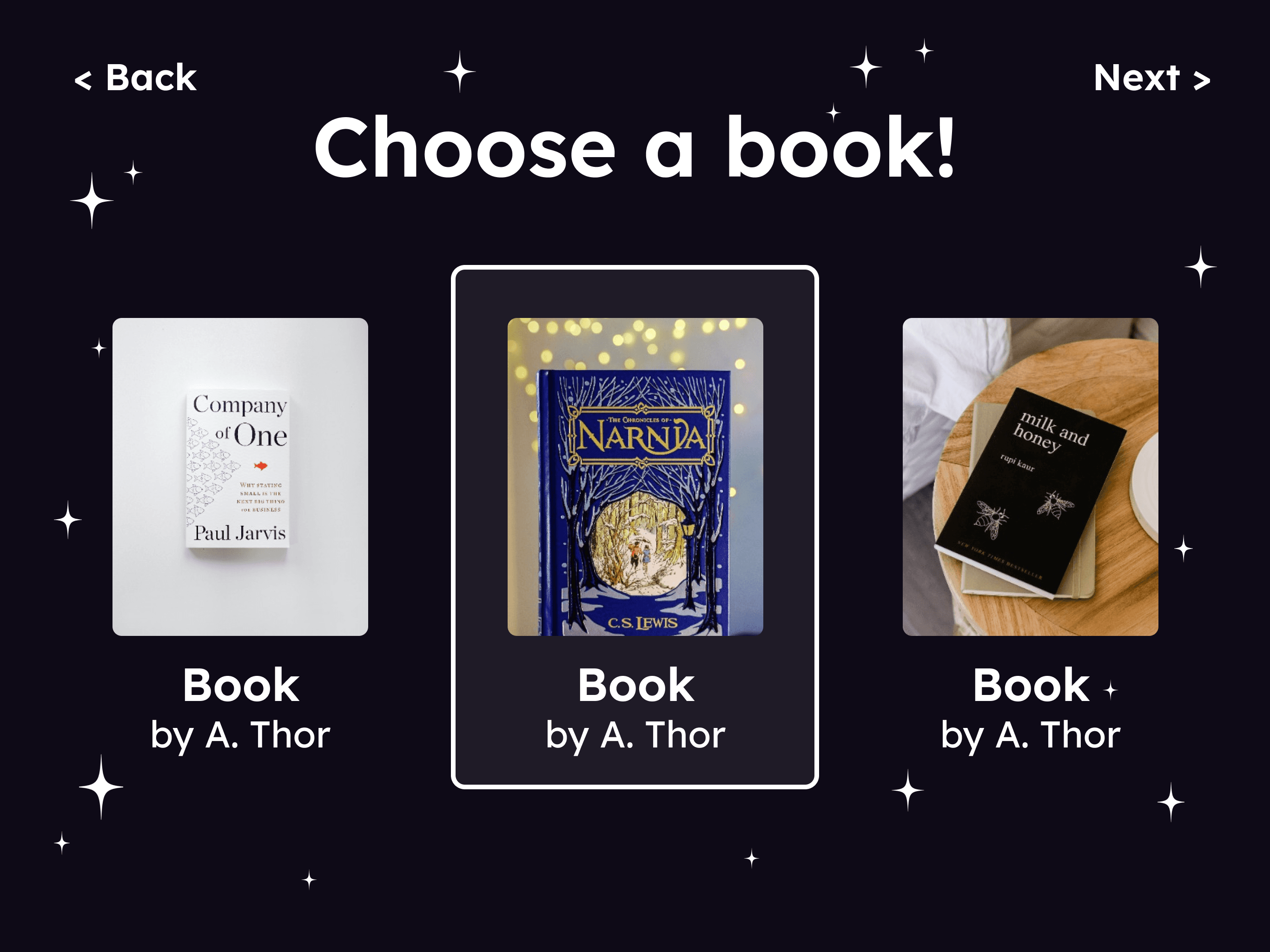
Choosing a book
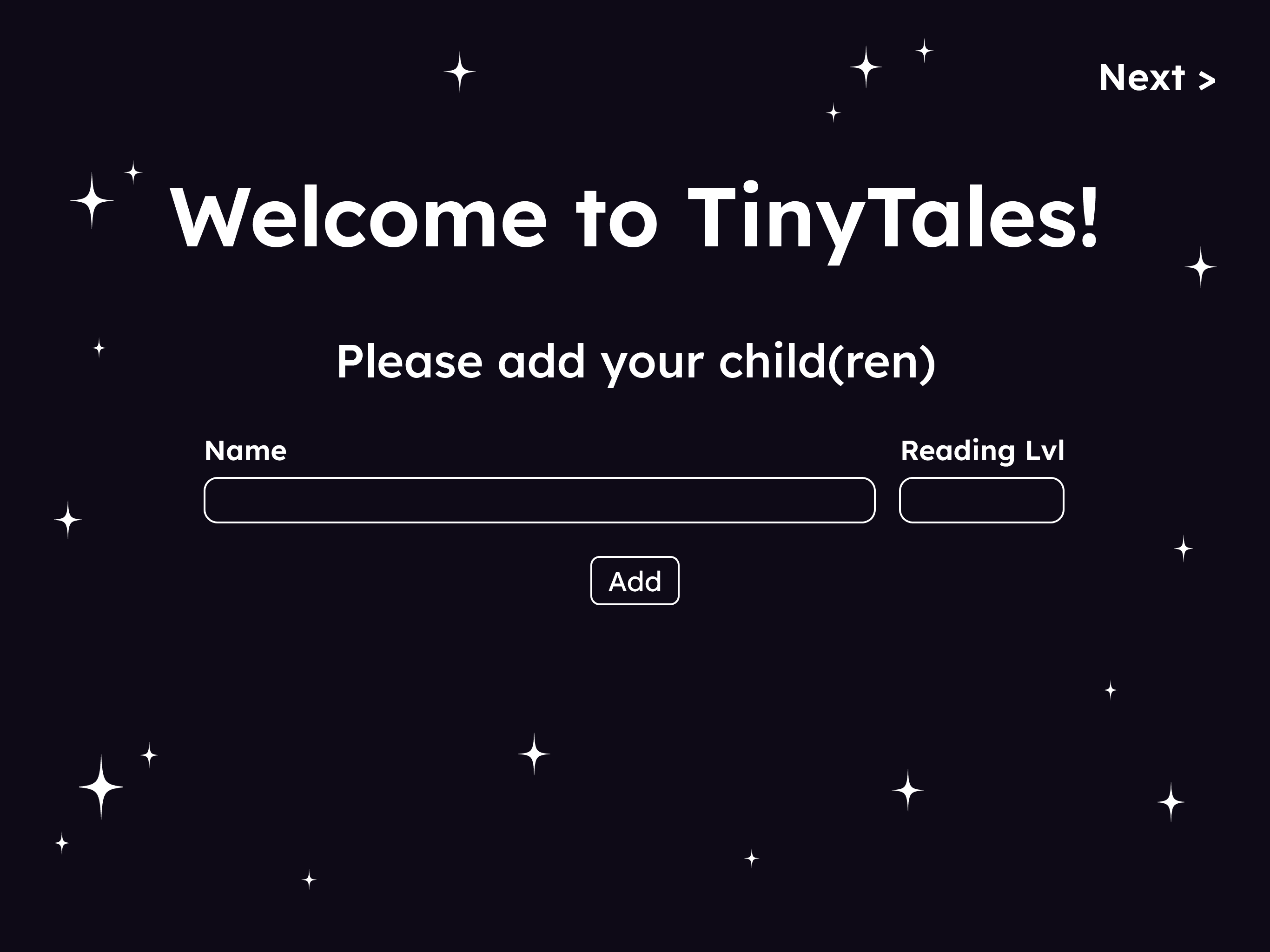
Onboarding
Day 5: Test & Iterate
Usability Test Insights
Key takeaways from the testing out the prototype
Aesthetics and language should be more playful and light for families.
Emphasis Choose screen is for children.
Readlist was assumed to be Favorites. Need to clarify function.
Iteration
Changes made based on usability test feedbacks
Wrap Up
Future Actions
Improve aesthetics and interactions to cater to families.
Add reading level to onboarding and information button.
Create clarity in lists (Favorite, Saved to Later, Individual Profiles).
Work on edge cases like adding more than 3 books choose.
Learnings
Improved ability to connect to the audience
Bedtime reading is vital to some parent child relationships so this had to be handled with care
Keeping in mind the entire experience from both perspectives to create a
Test early and often, especially when you’re stuck
I got from conducting usability extremely valuable feedback from usability tests
Getting fresh new perspectives gave me so many ideas
I felt stuck for a long time designing in Figma alone without feedback.
It was feedback from testing made it clear where to go next.
User tests are people are offering opinions and critique and ultimately I have to make the decision as the designer.


