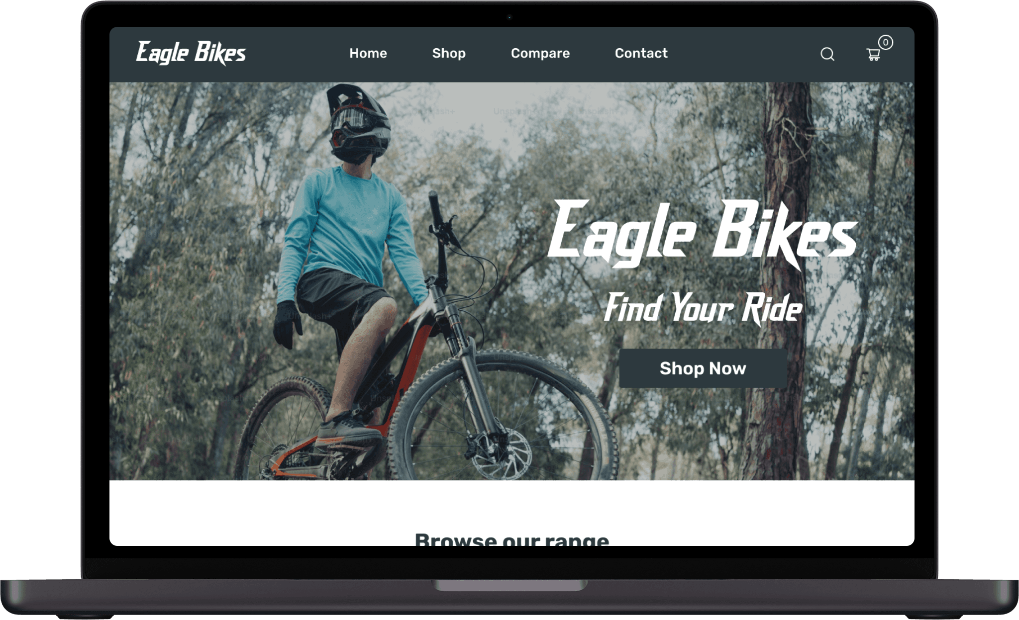
Find your ride
Role:
Sole Product Designer
(with mentorship)
Context:
Capstone 2 Project
(UX/UI certification)
Summary:
E-commerce website for bike enthusiasts
The Problem:
People bounce after looking at a few bikes and leave checkout after reaching registration.
The Solution:
Create a website with a comprehensive Compare feature and Guest Checkout.
Project Plan
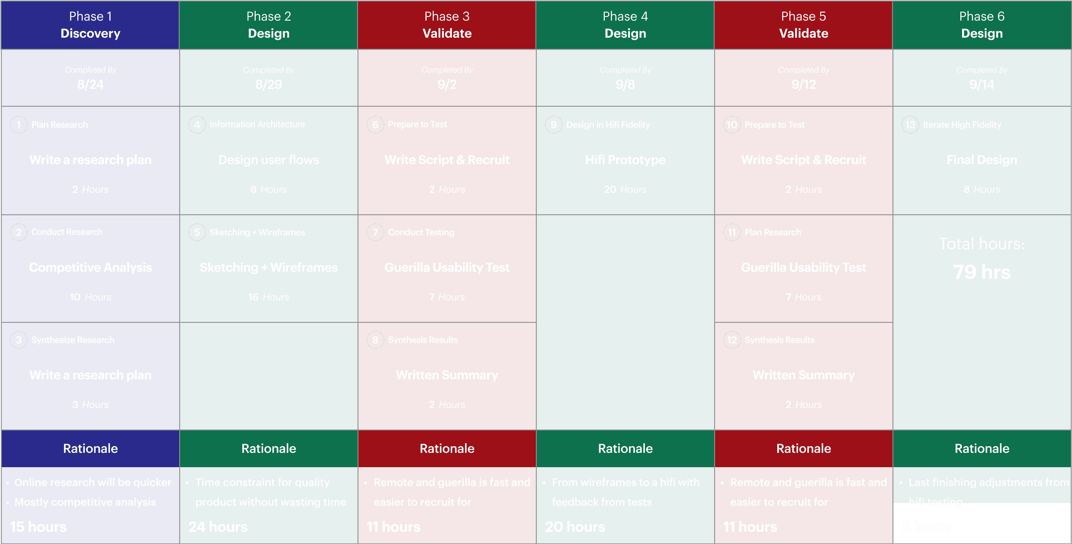
1. Discovery
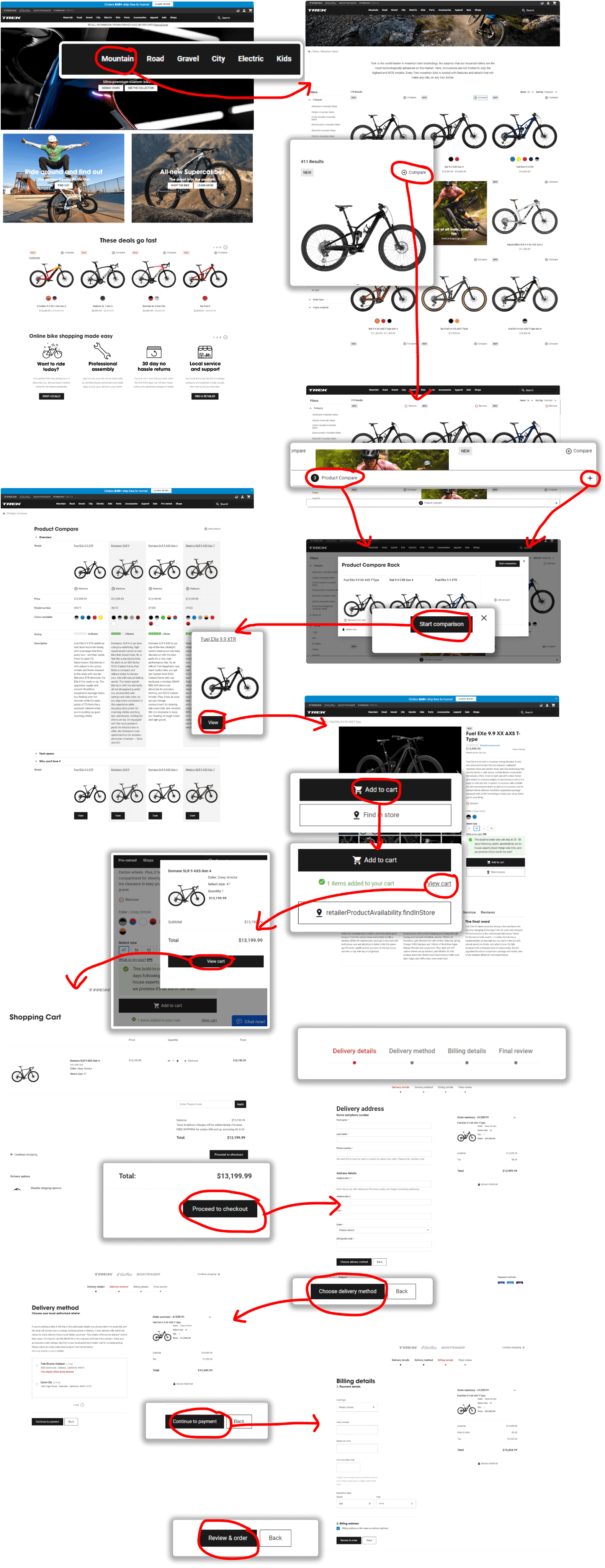
I studied ecommerce websites that had a Compare feature and sold bikes to find recurring patterns.
Competitive Analysis
Learning from existing user flows in the space
Likes:
Sleek visual style
“Compare” very functional
Clear checkout process
Dislikes:
Ability to expand/collapse “Compare” details
Action Items:
Better information organization for “Compare”
Research Insights
Insights from analyzing existing products
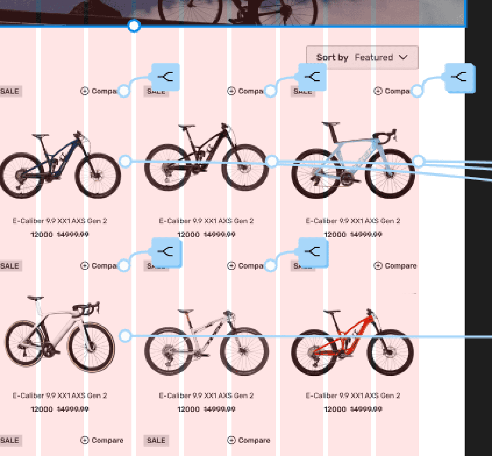
Users should be able to choose which products to compare.
“Compare” needs to be discoverable on the catalog page.
After decision to purchase is made, checkout should be frictionless
2. Low Fidelity
Creating a great “Compare” feature requires giving users organized, clear product information
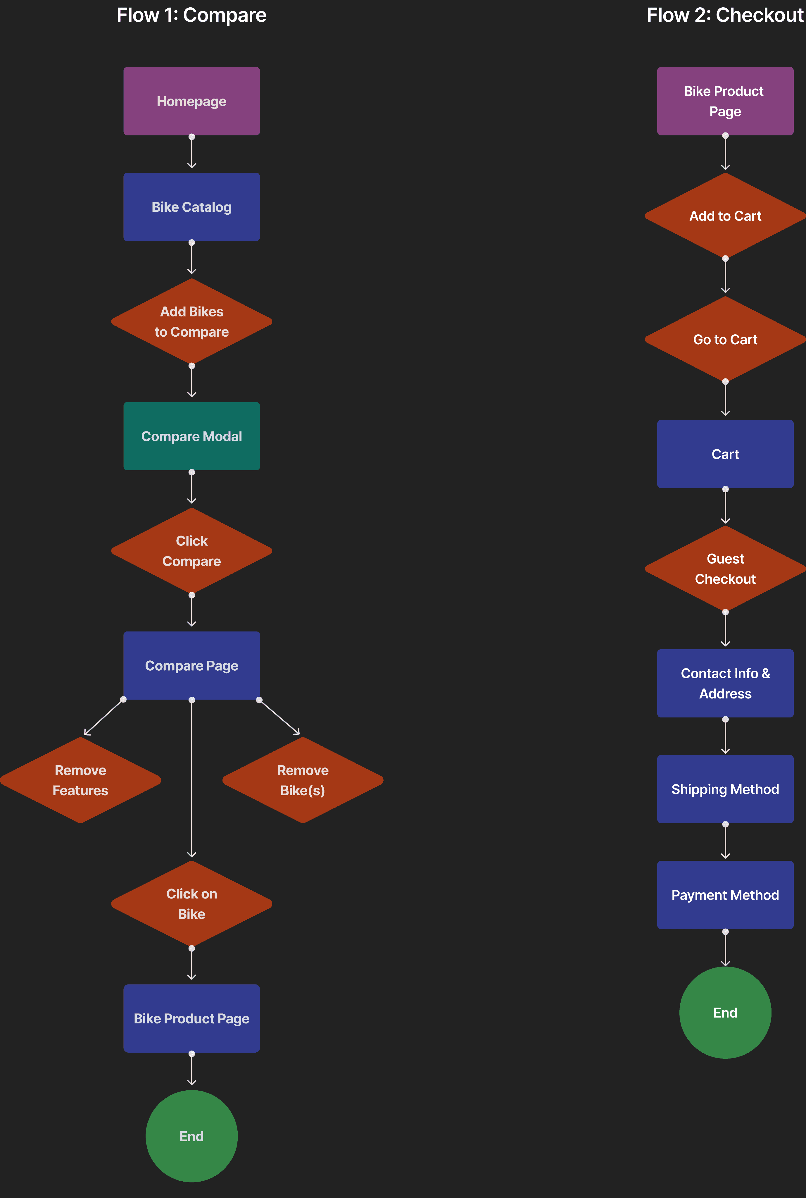
User Flows
Map of the ideal user experience

Lofi Prototype
Initial prototype of solution based on research
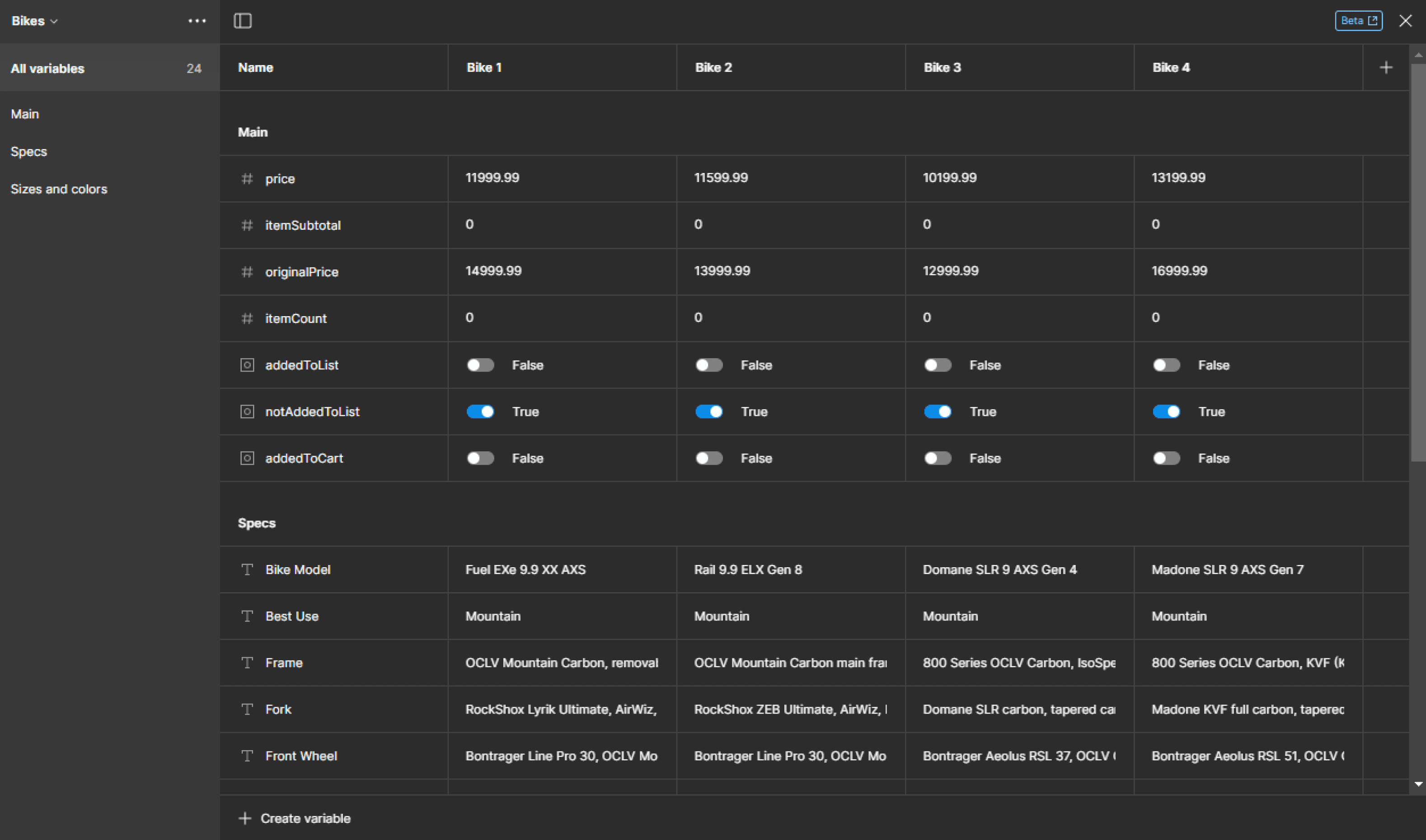
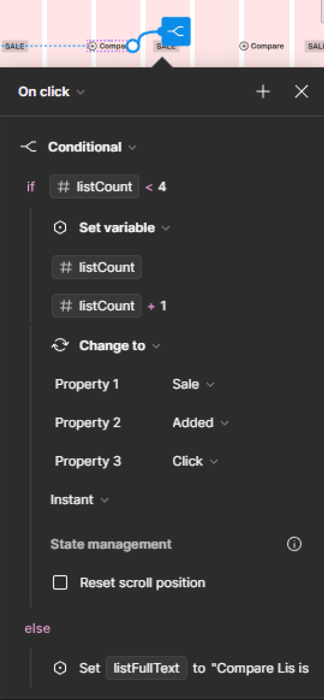
The biggest obstacle I faced was learning to prototyping with variables.
Homepage to Compare flow
Variables Panel
Conditional Statement
Prototype Example
Usability Test
Key takeaways from the testing out the prototype
The “Compare List” was not comprehensive
The prototype and interactions were not fully functional
Reviews need to be more visible.
3. High Fidelity
Though difficult, I had a lot of fun learning about the new conditionals and variables.
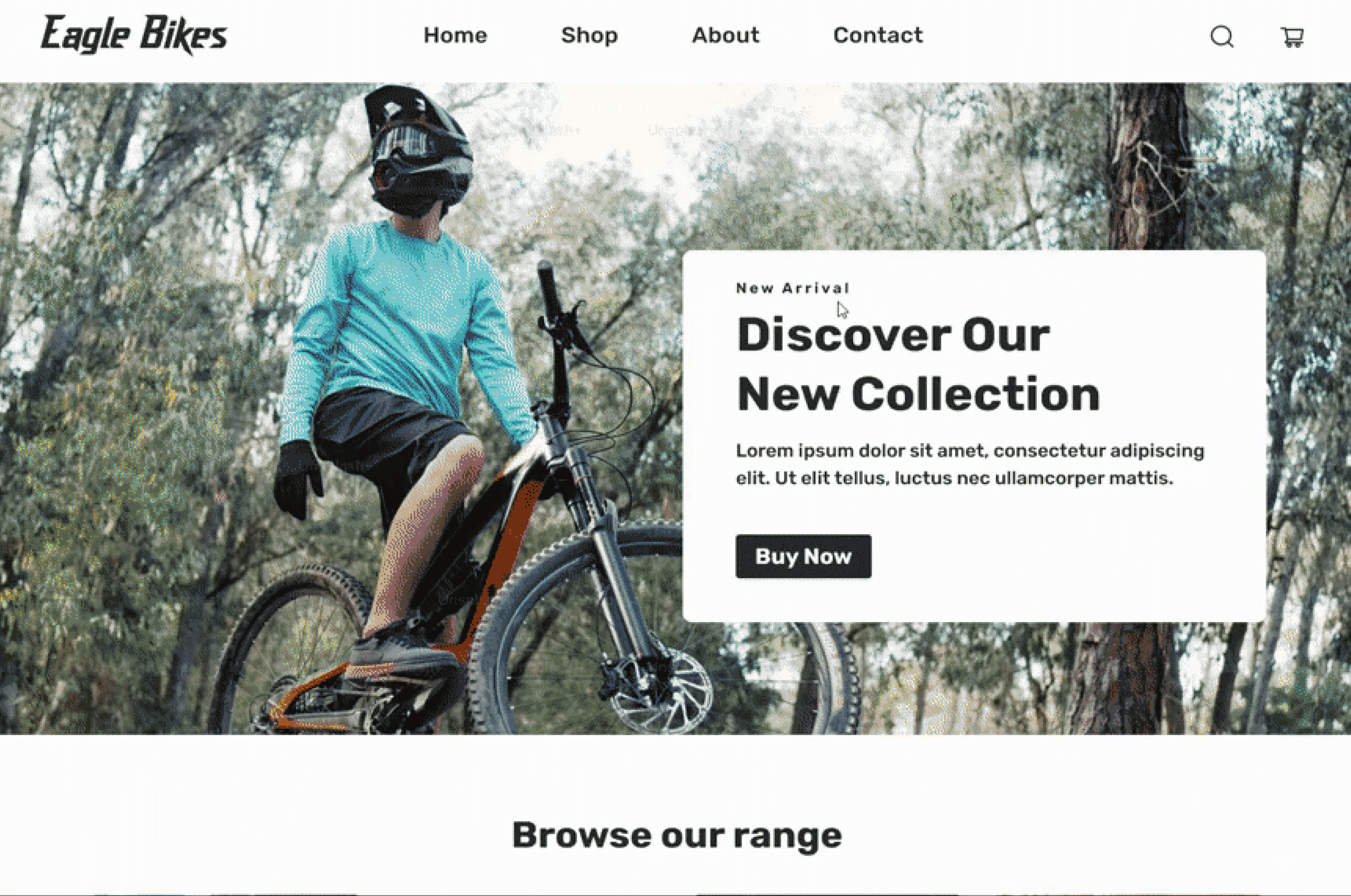
Homepage to Compare List
Compare List to Cart
Cart to Checkout
User Research Insights
Key takeaways from the research
Homepage needs more content, feels empty.
Review section populated and added to “Compare List”.
Page headers at the top could be changed and improved.
Prototype Link
Wrap Up
Future Actions
Reviews are still an important feature I want to improve on.
Create layout for homepage content and promotions.
Add micro interactions to improve experience and feel.
Change page headers to be more interesting.
Wrap Up
Future Actions
Reviews are still an important feature I want to improve on.
Create layout for homepage content and promotions.
Add micro interactions to improve experience and feel.
Change page headers to be more interesting.
