Crease Pro

Crease Pro

Crease Pro

A better way to train.

Role:

UX/UI Designer (team of 3)

Role:

UX/UI Designer (team of 3)

Role:

UX/UI Designer (team of 3)

Context:

Startup Design Internship

Context:

Startup Design Internship

Context:

Startup Design Internship

Summary:

AI Lacrosse Trainer Mobile App

Summary:

AI Lacrosse Trainer Mobile App

Summary:

AI Lacrosse Trainer Mobile App

The Problem:

Crease Pro is an lacrosse training app that is looking to increase daily engagement.

The Solution:

Create a team hub for communication and a store with gamified incentives.

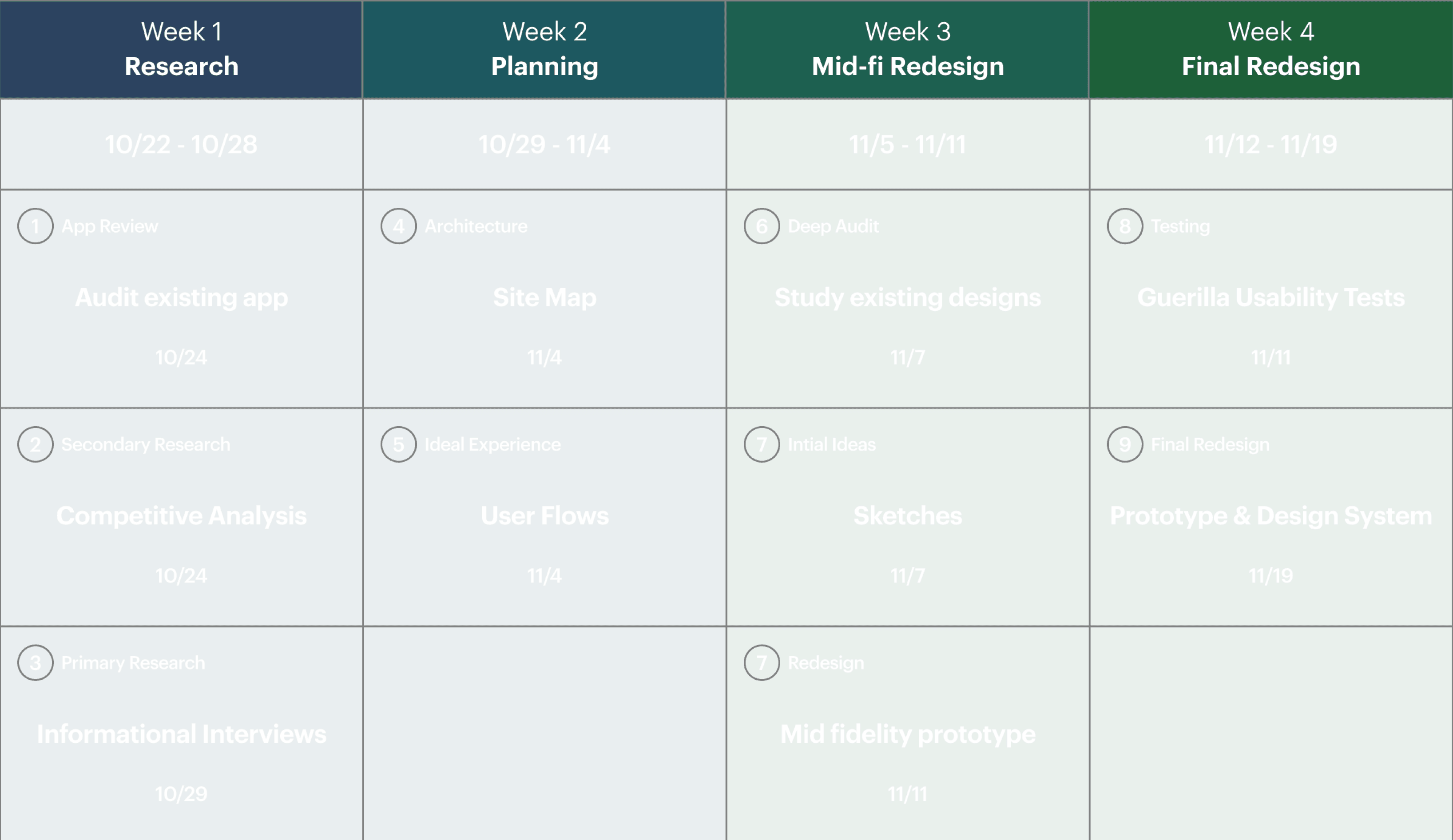
Timeline

Week 1: Research

Our research goal was to understand the current space of gamification and sports trainers.

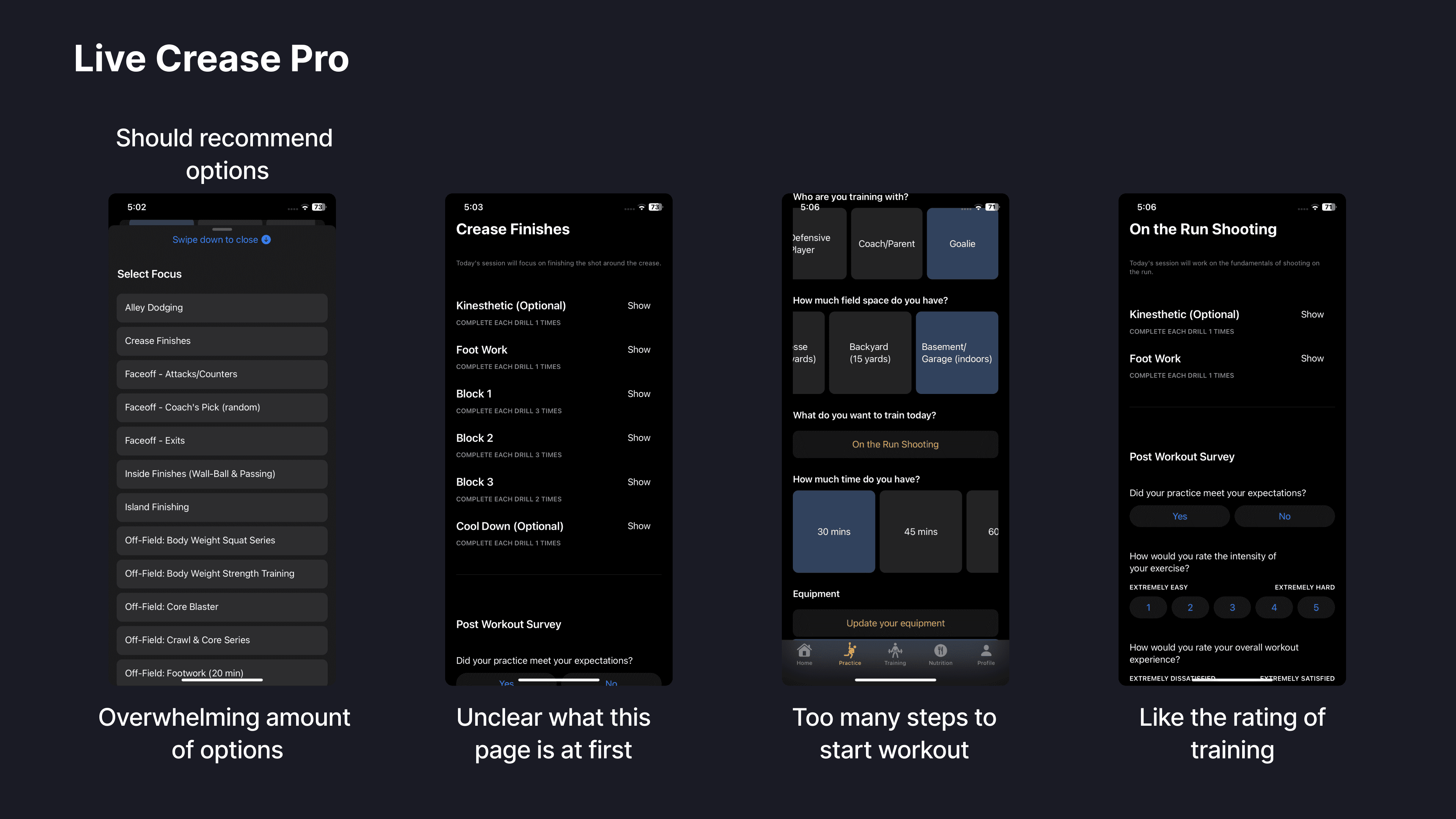
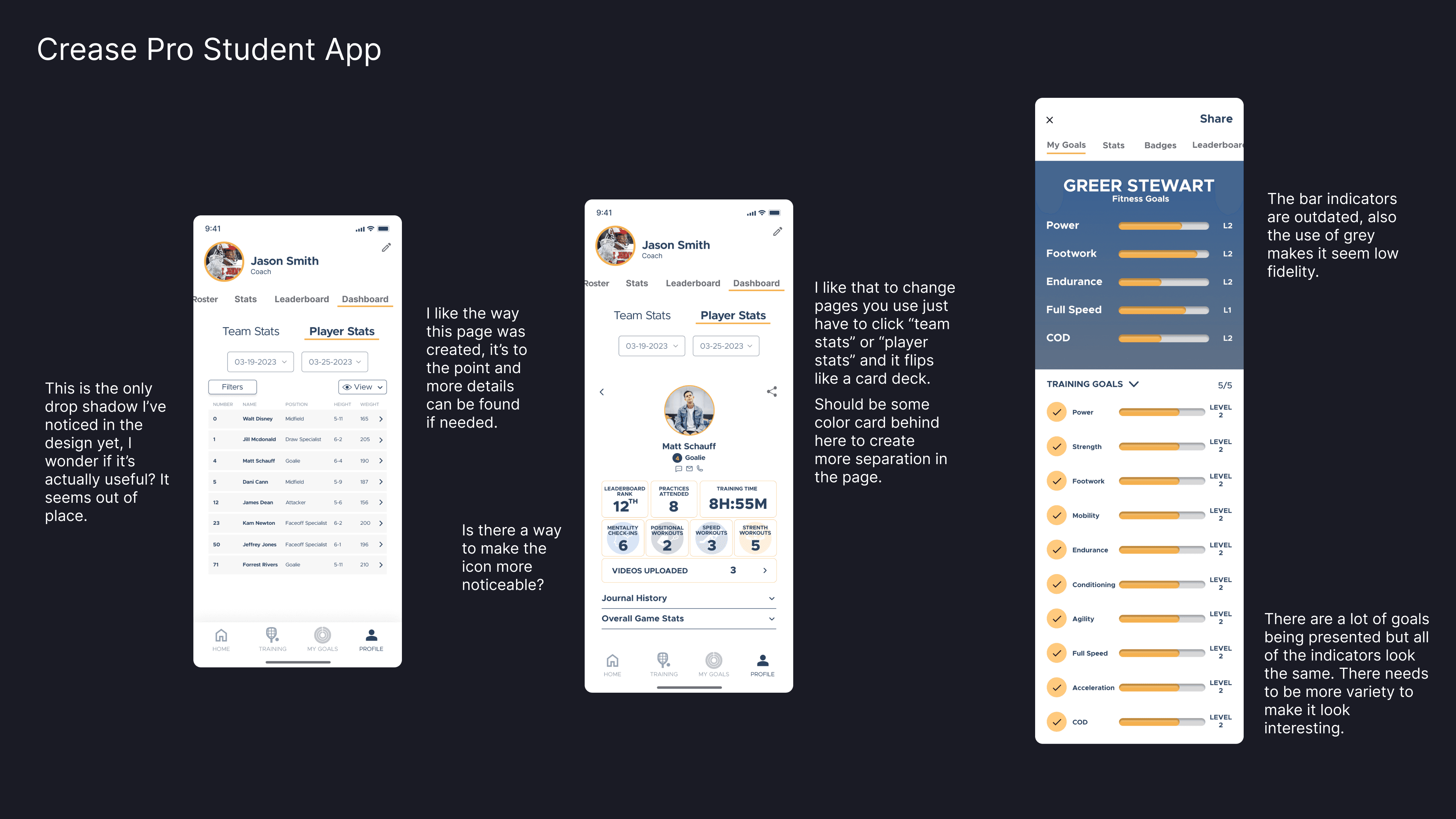
App Review

Studying and auditing the existing designs of the product

App Available in App Store
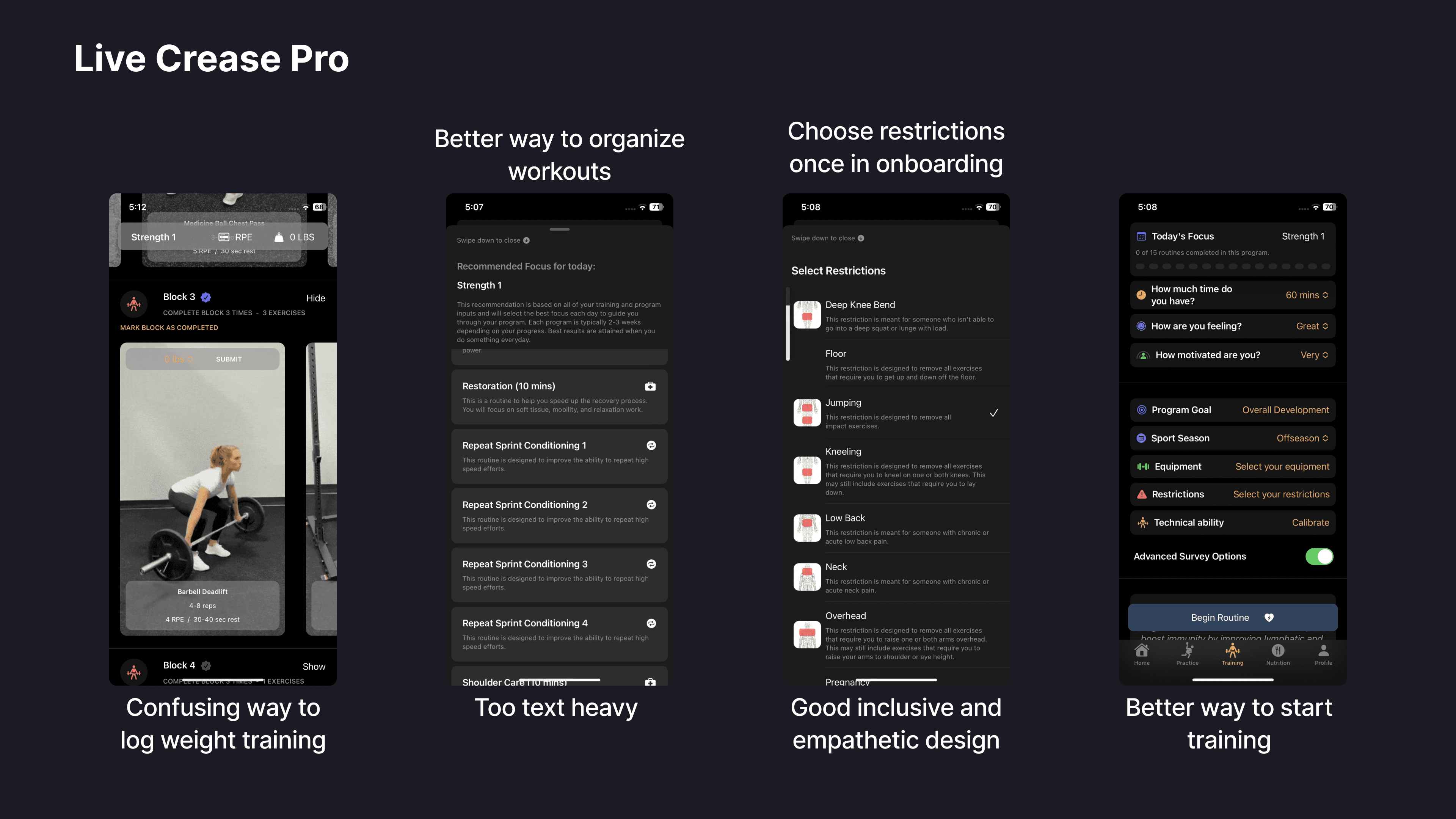
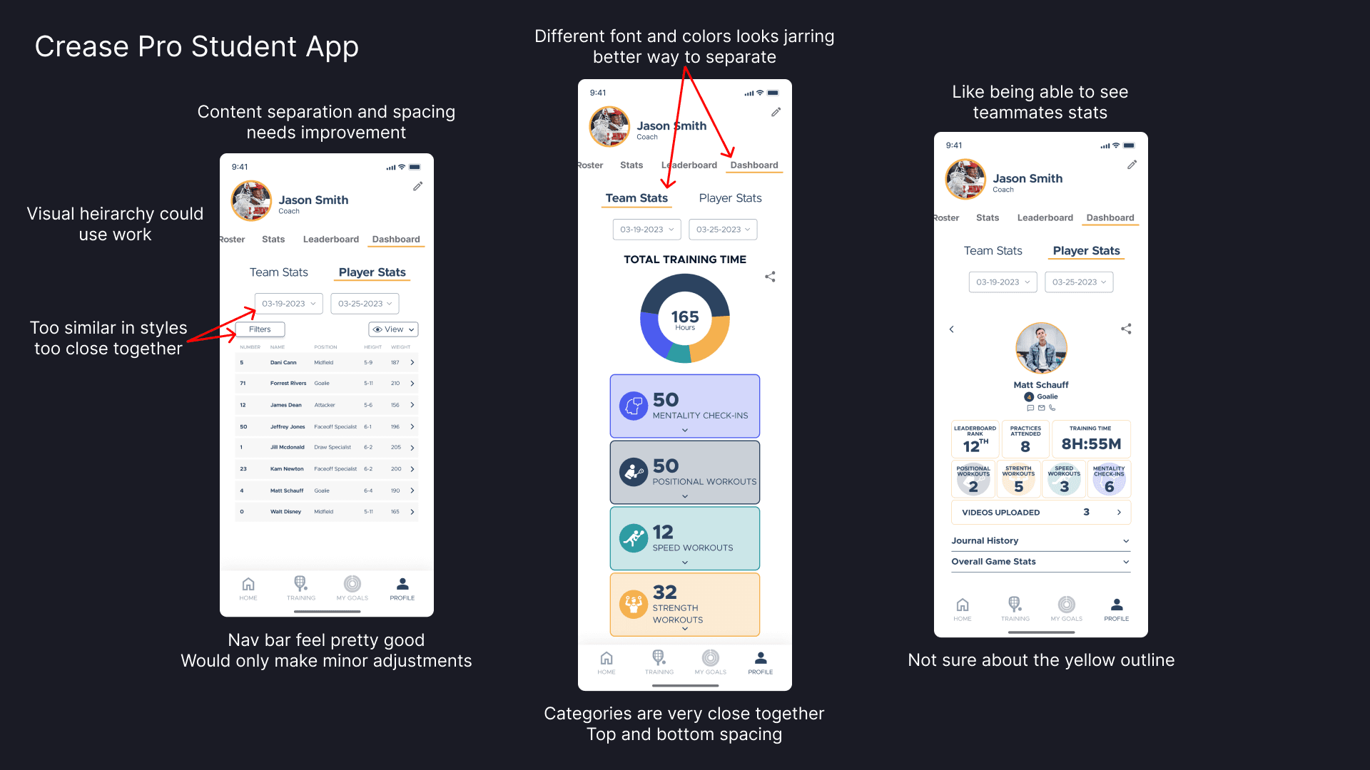
Previous Interns’ Designs
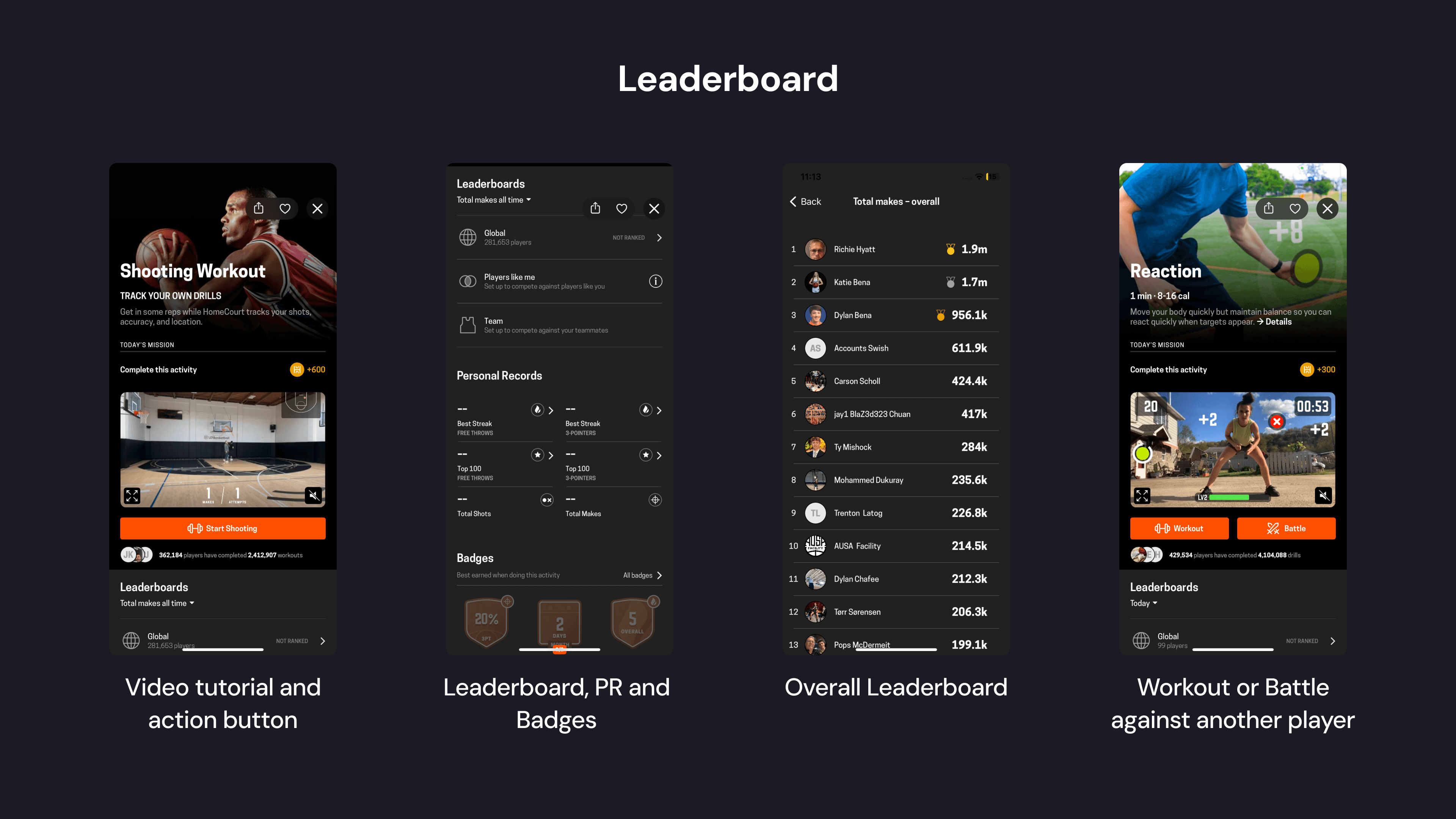
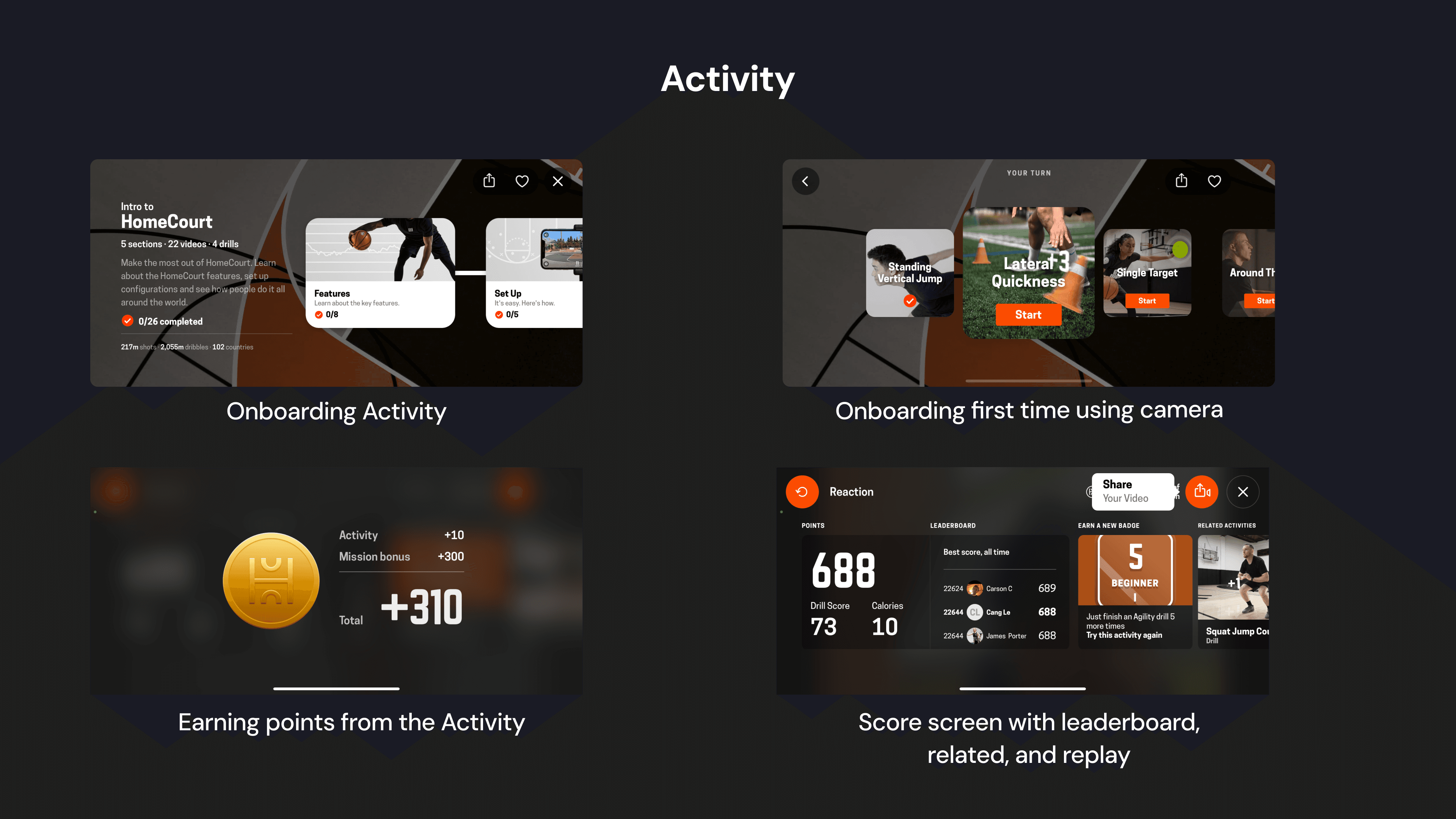
Competitive Analysis

Learning and drawing inspiration from existing products in the space

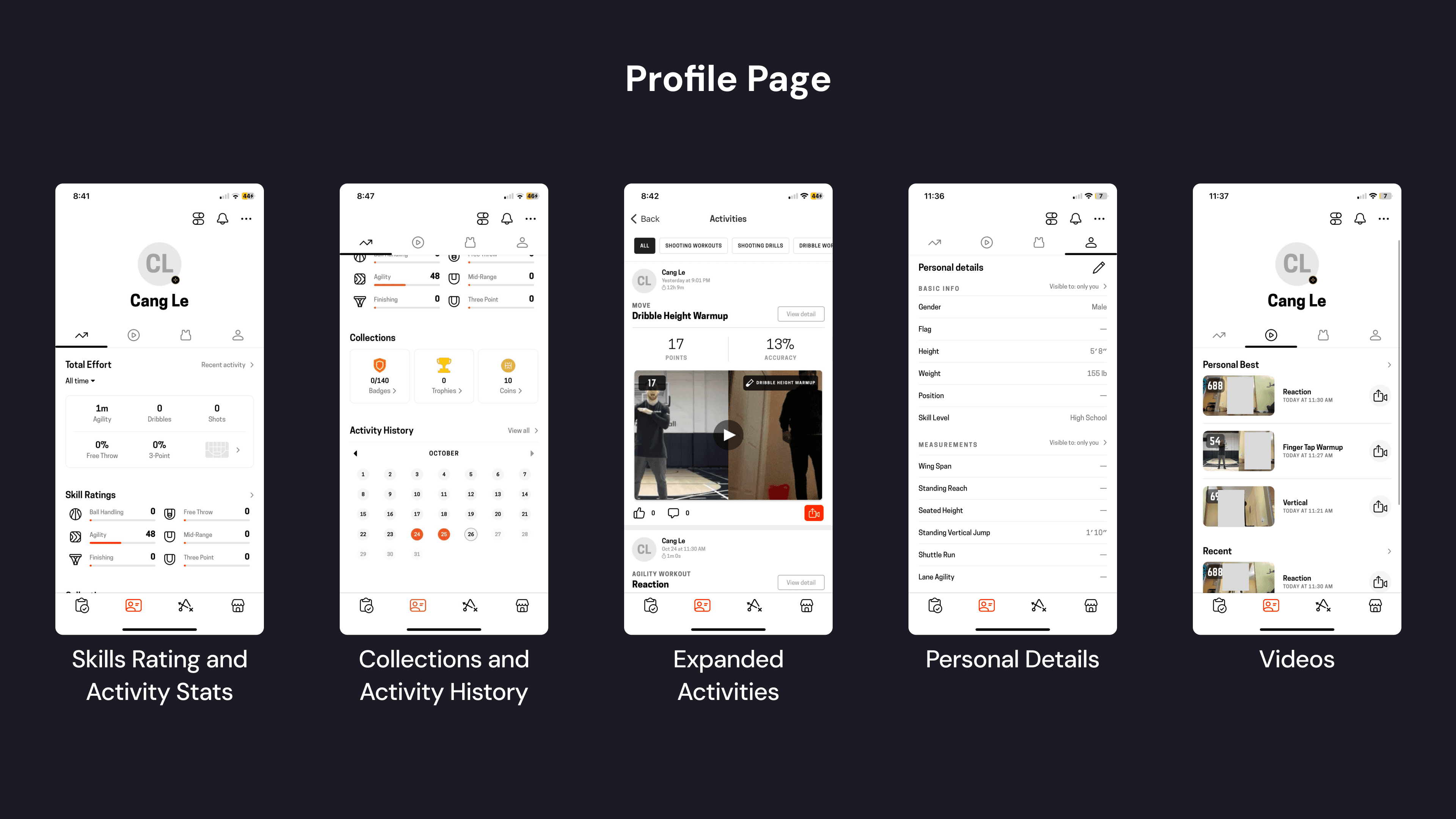
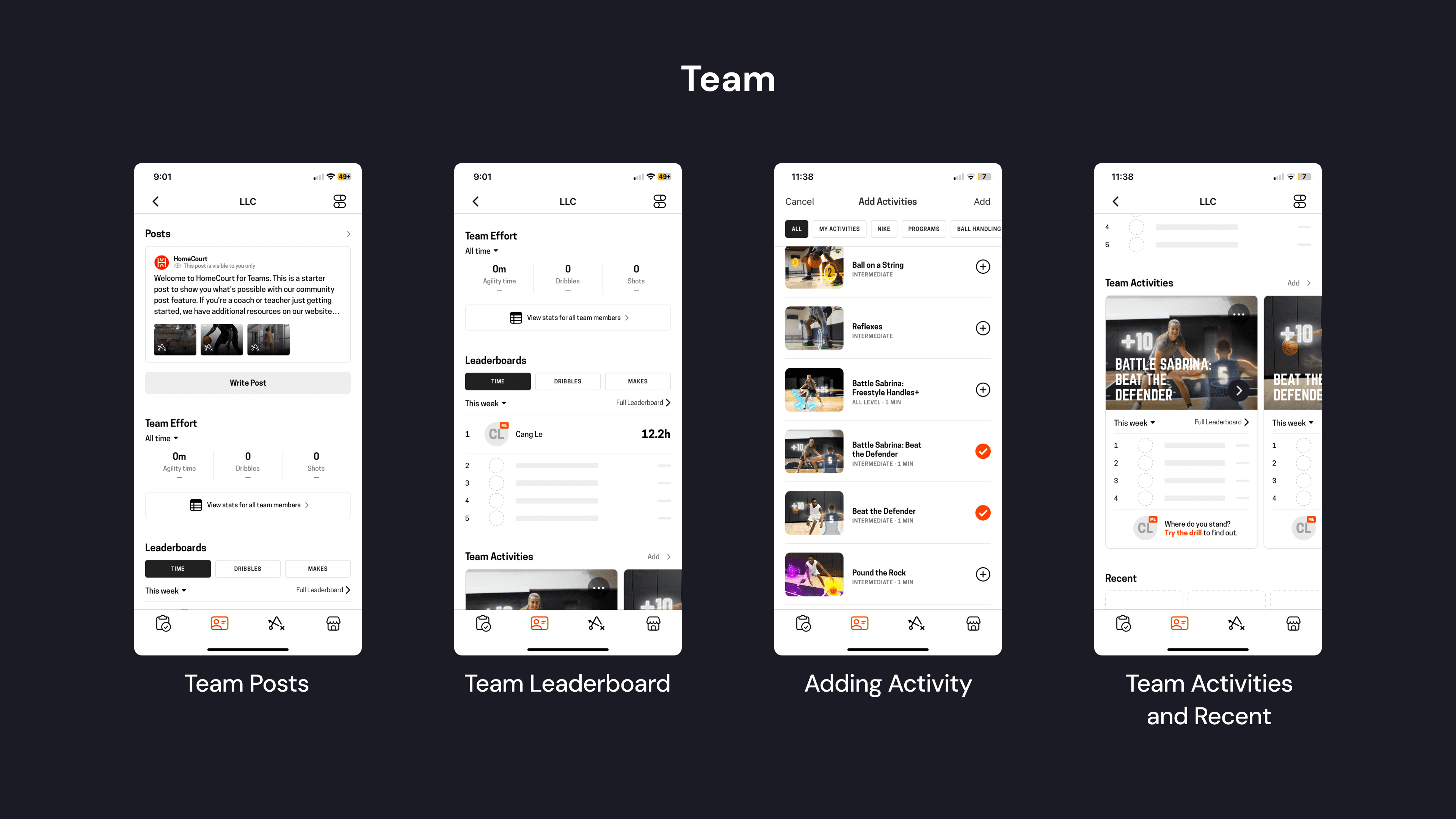
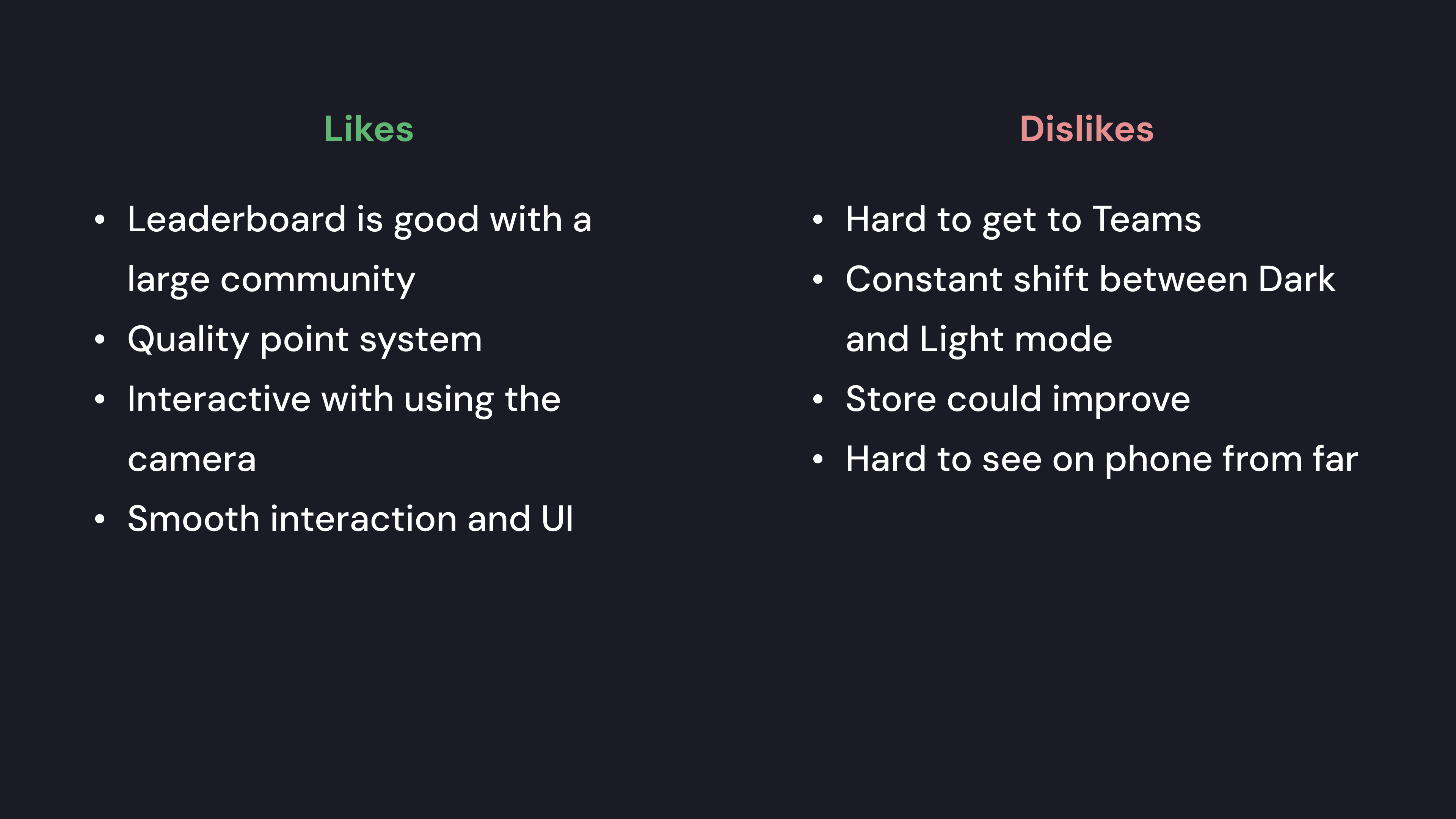
We learned a lot from existing mobile training apps like HomeCourt.
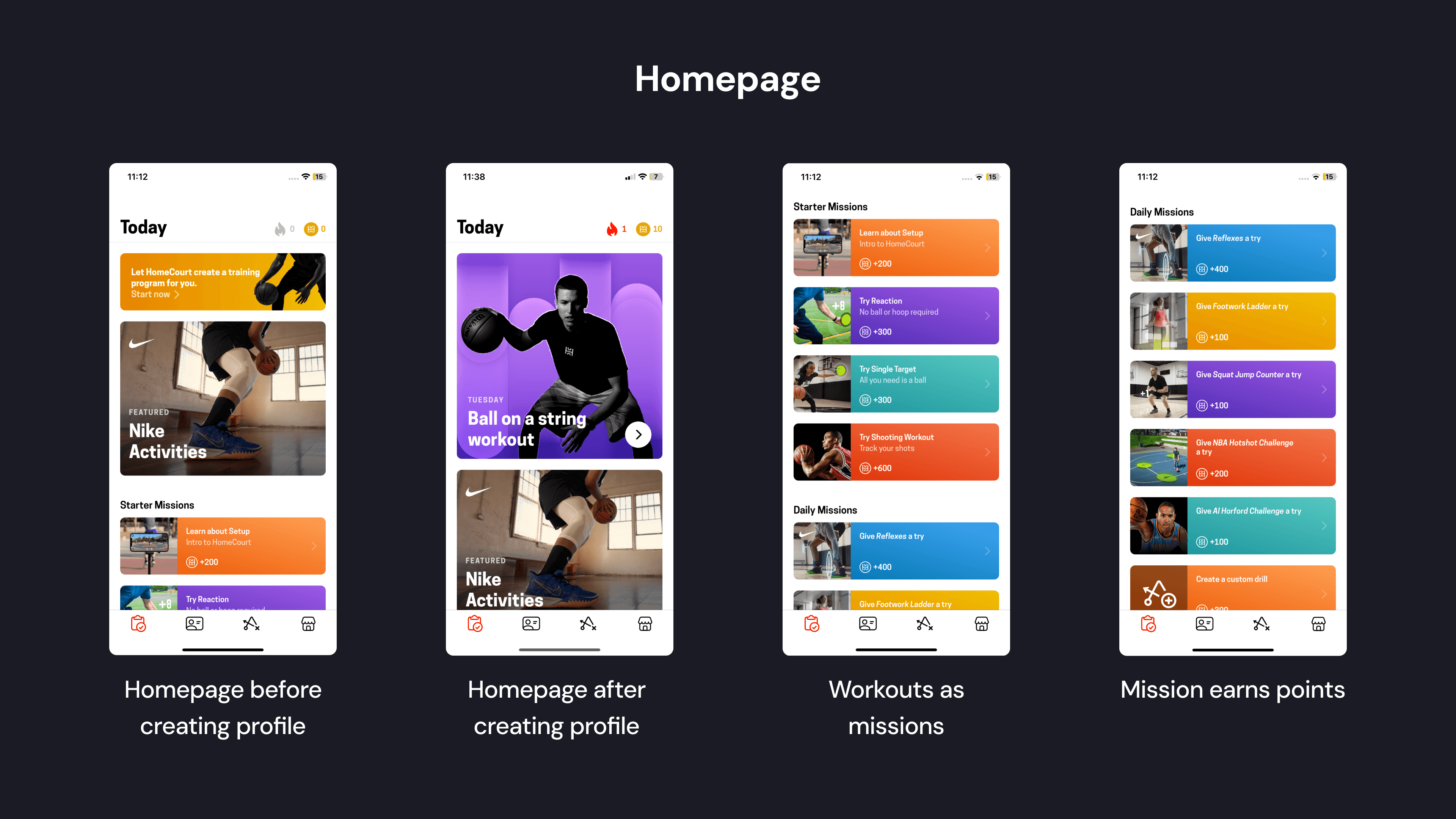
Afterwards, we interviewed lacrosse players and coaches to learn what drives and motivates them.

Informational Interviews Insights

Interviews Insights

Learning for real lacrosse players and coaches to understand and empathize.

Learning from players and coaches to understand and empathize.

  • Community and team connection is important

  • Competition is motivating (vs. self, teammates, other teams)

  • Affirmation/recognition can increase performance.

  • A good coach is patient and caring but pushes boundaries.

Core Features to Boost Engagement

Our main direction based on insights from analyzing existing products

  1. Recognition and rewards

  2. Competition (with self and other)

  3. Team communication

Week 2: Planning

Creating clear informational architecture was crucial to designing a cohesive product.

Creating clear informational architecture was crucial to designing a cohesive product.

Creating clear informational architecture was crucial to designing a cohesive product.

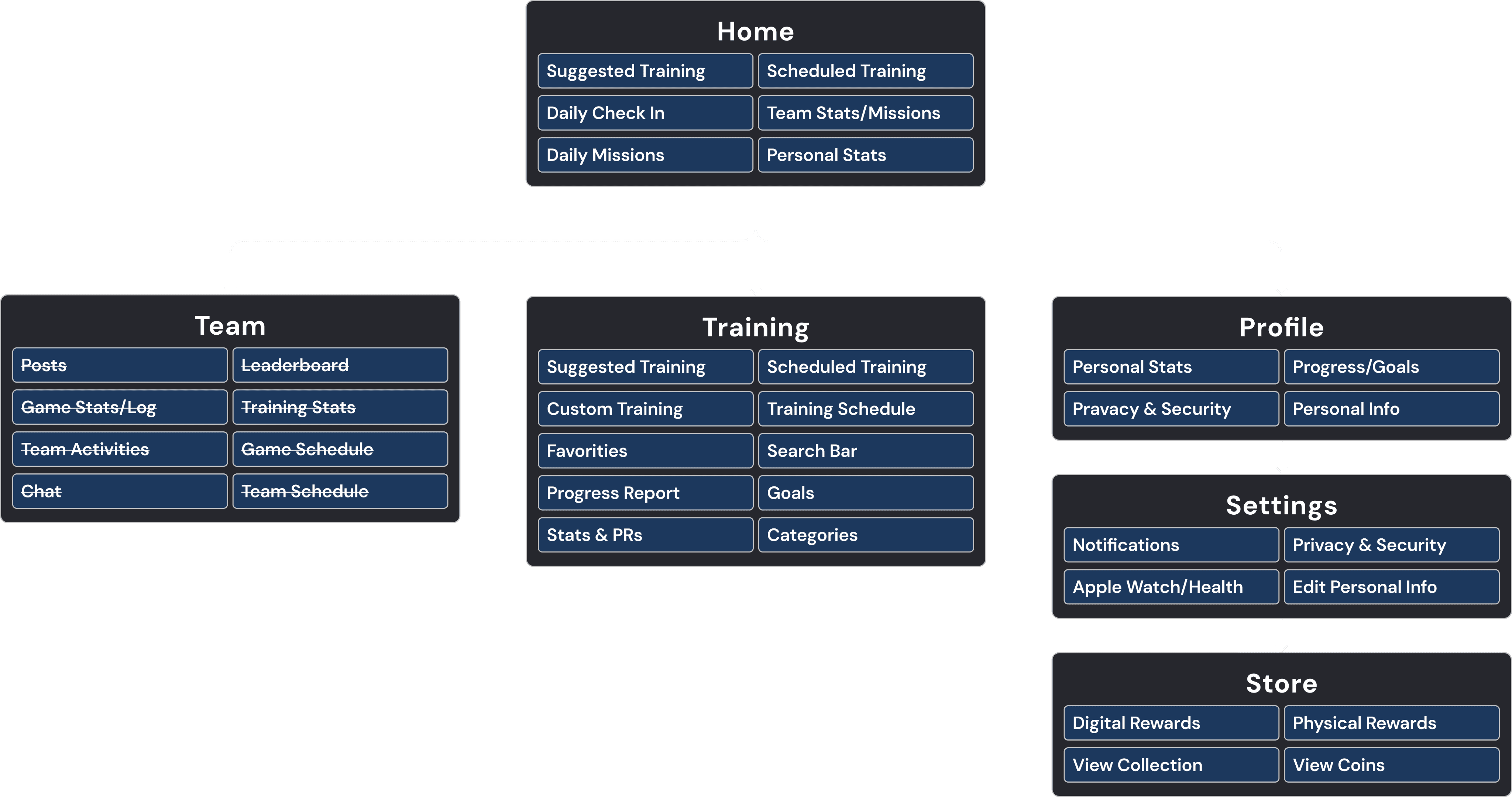
Site Map

Informational architecture map of the entire product
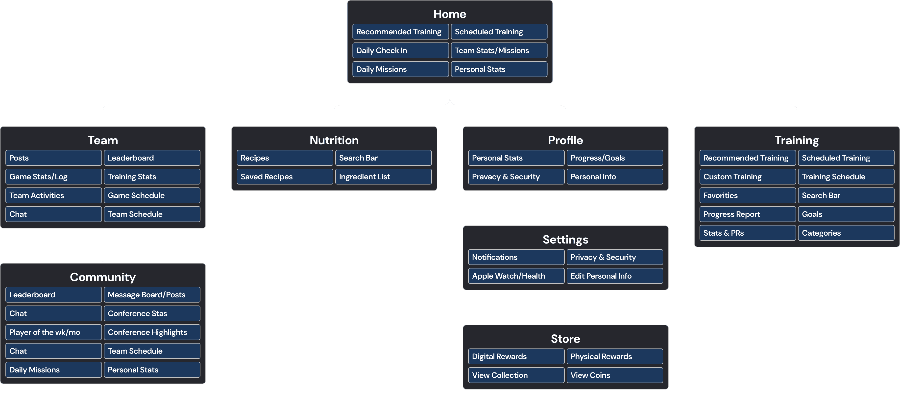
The sitemap has the tab title and features underneath to clarify layout to stakeholders.

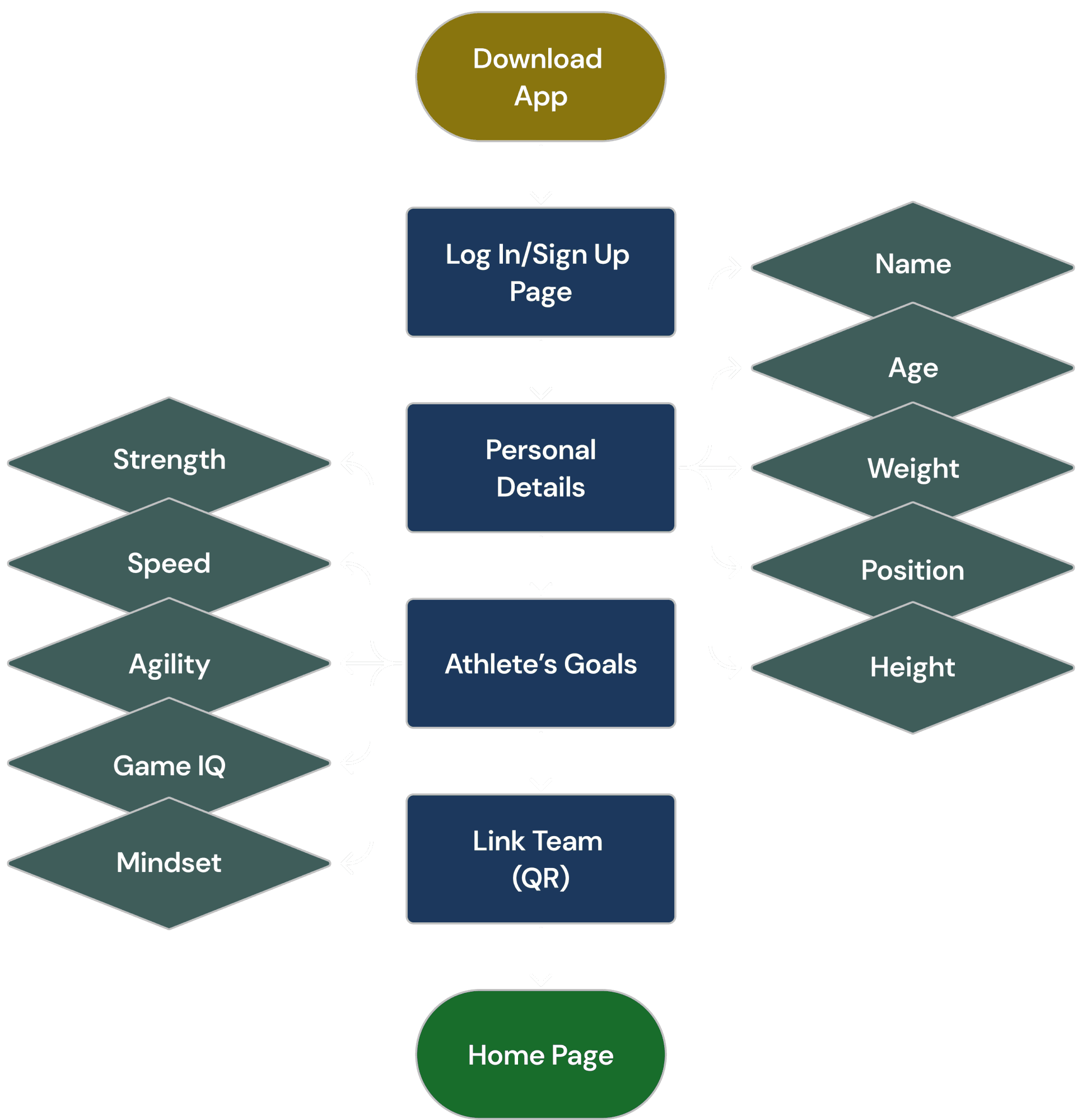
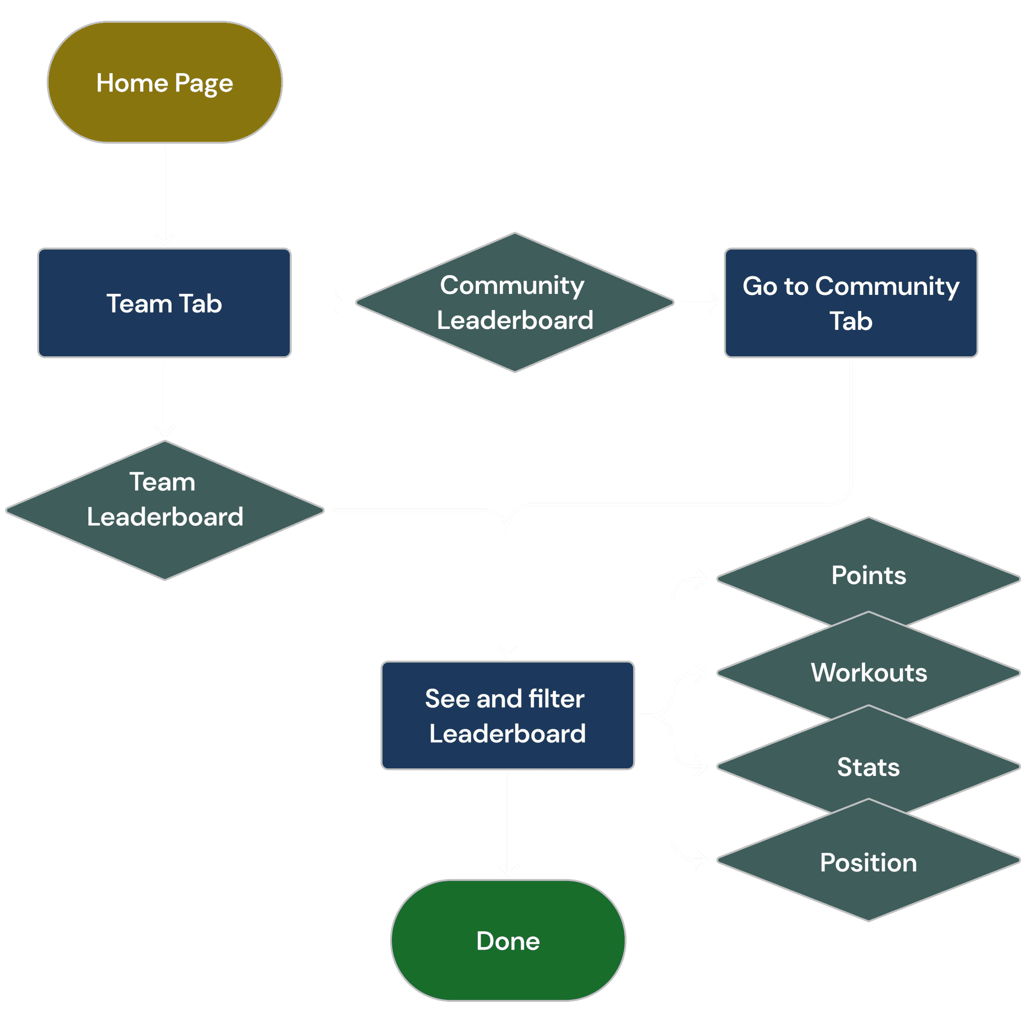
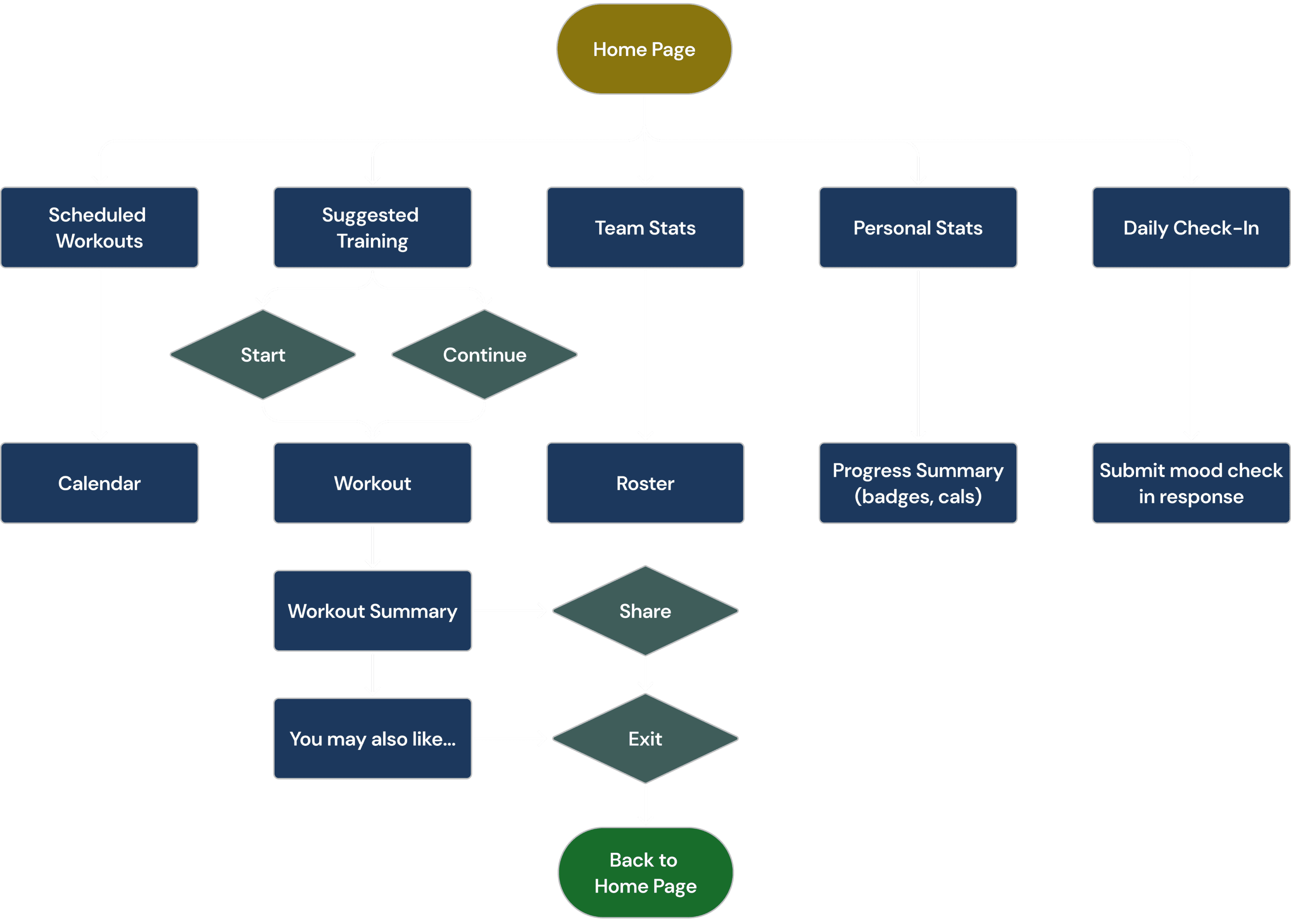
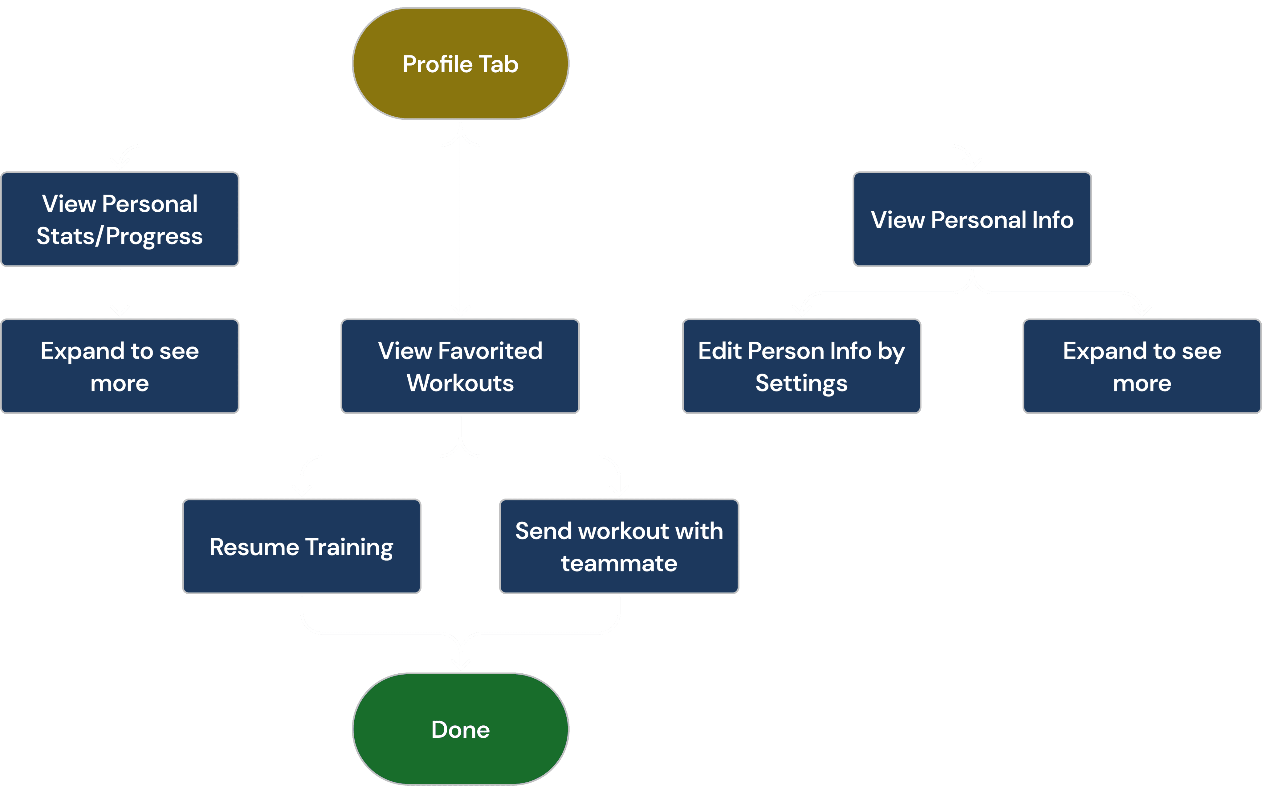
User Flows

Ideal users experiences and action flows.

Onboarding

Looking at Leaderboards

Start Training from Homepage

Start Training from Homepage

Navigating Profile

Looking at Leaderboards

Week 3: Mid Fidelity

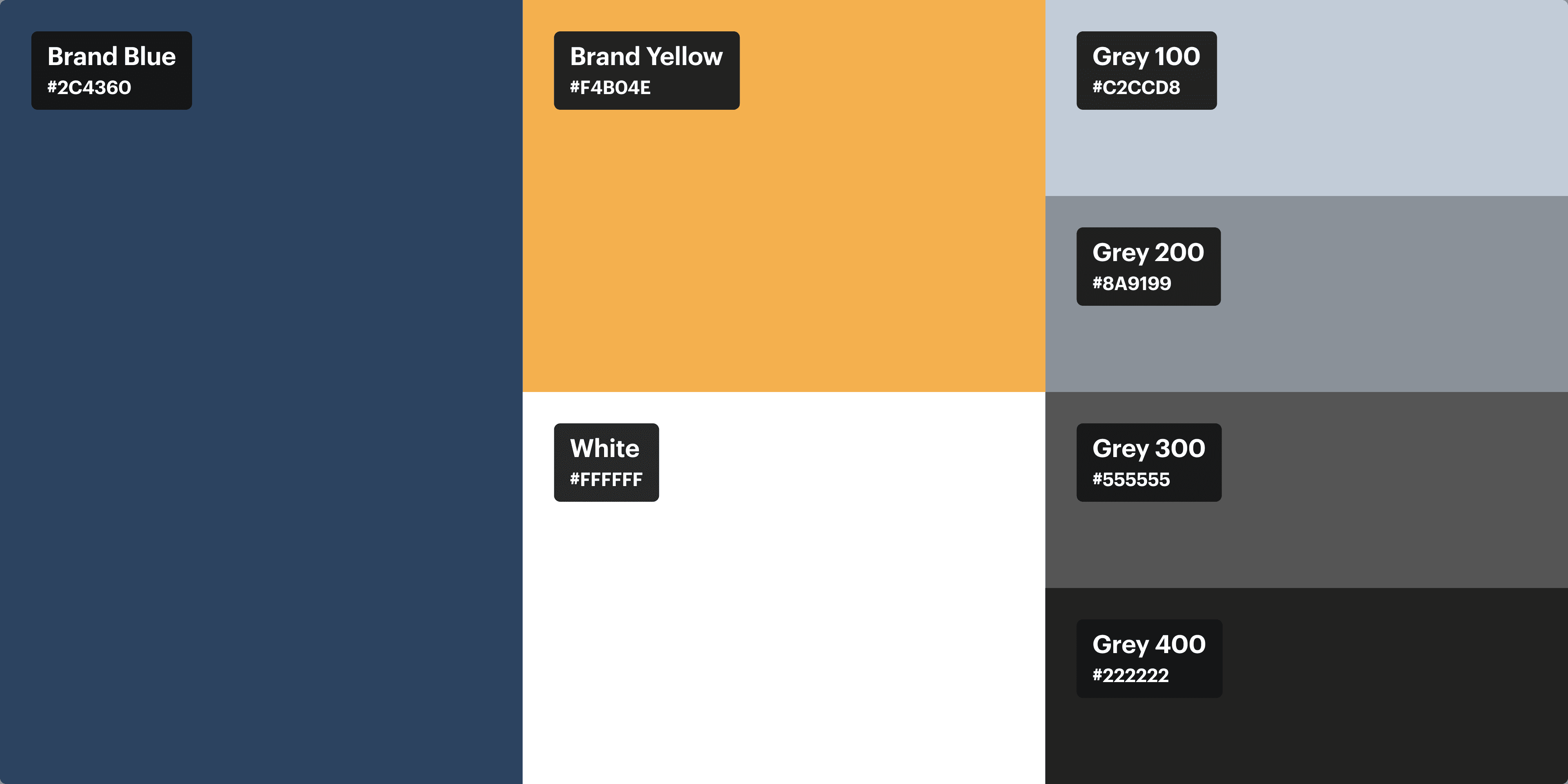
Color Palette

A color palette to create visual clarity and simplicity.

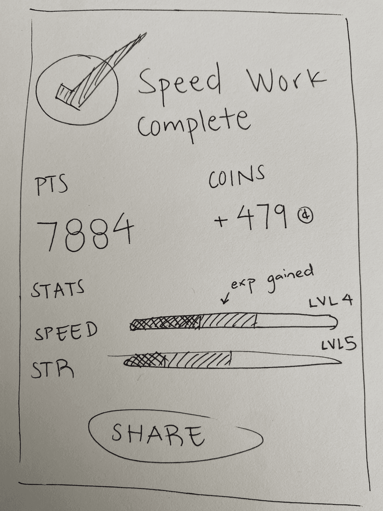
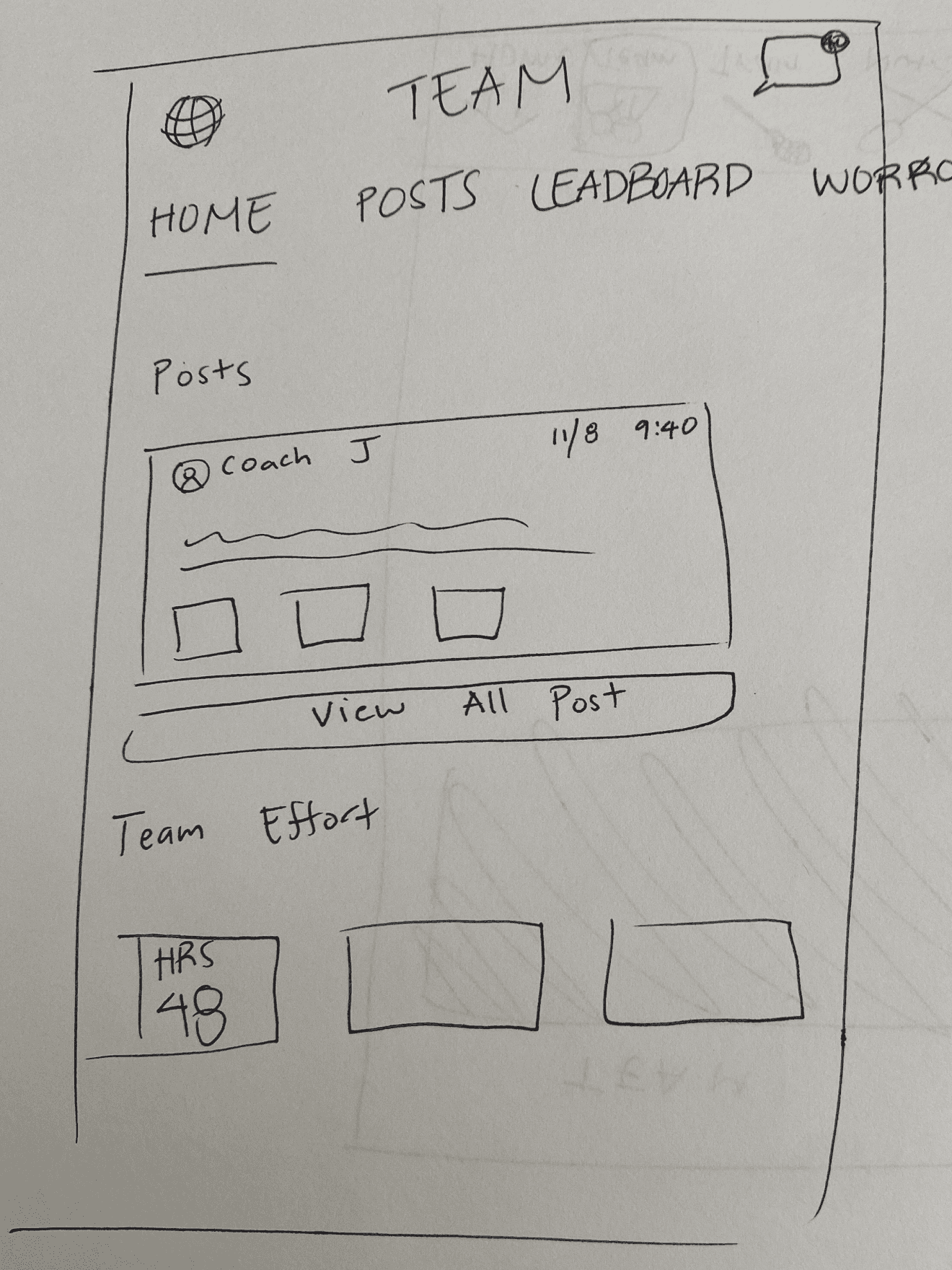
Sketches

Early ideation and exploration

Workout Completion

Completion

Workout Completion

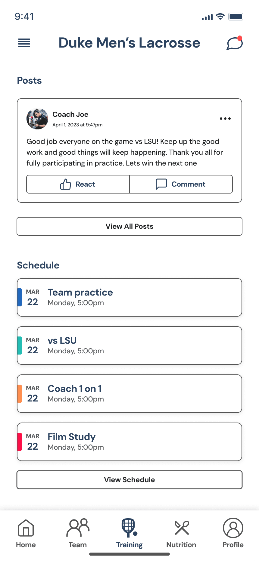
Team Hub

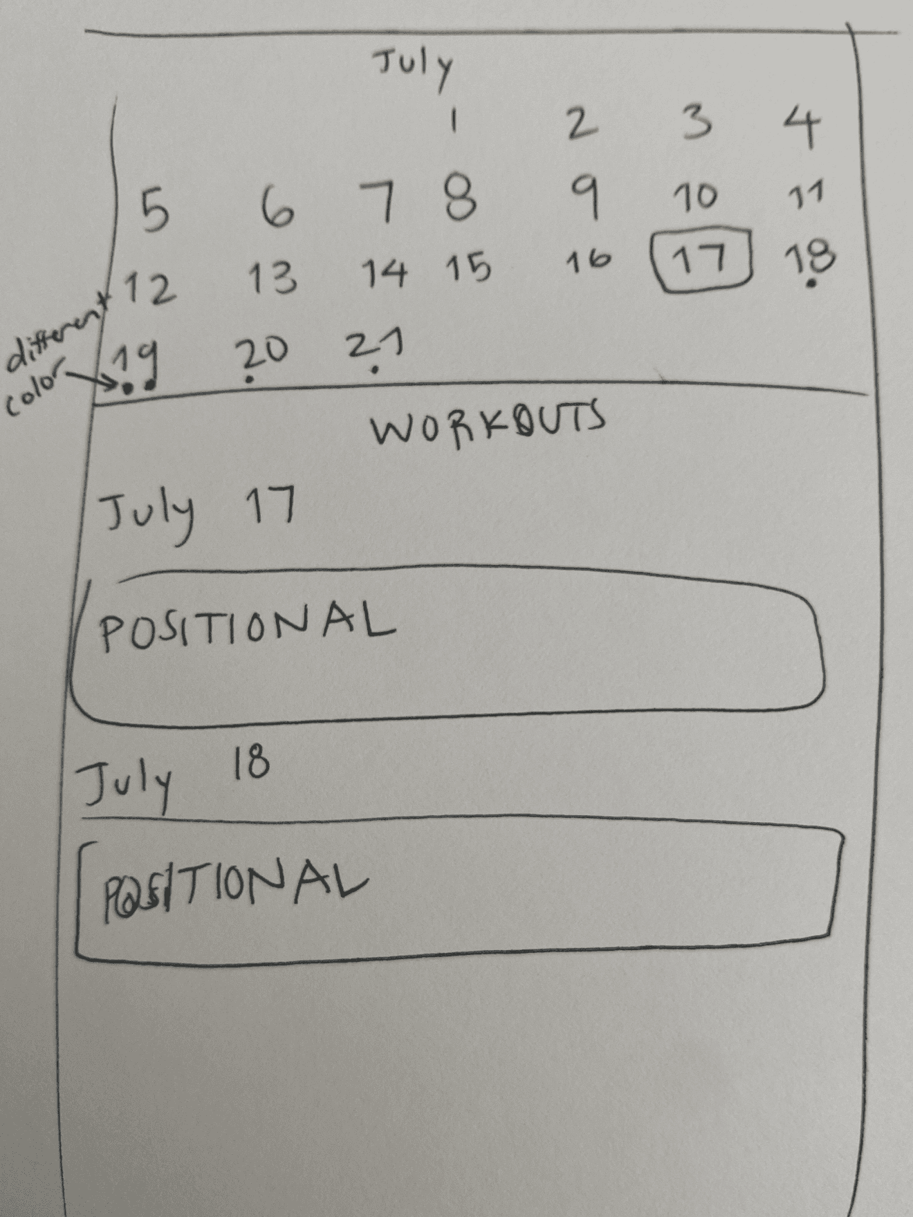
Schedule

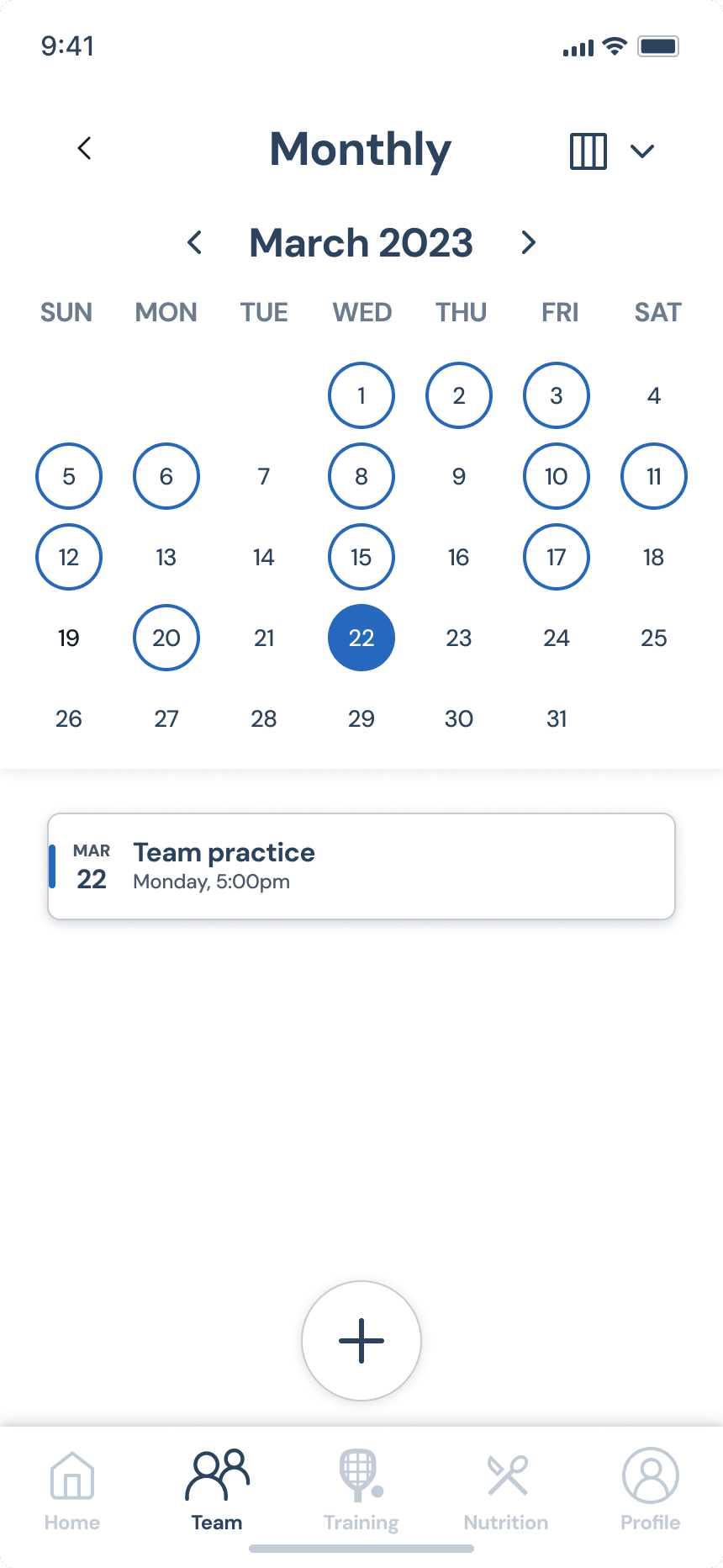
With the month timeline, we concurrently tested and designed to use time effectively.

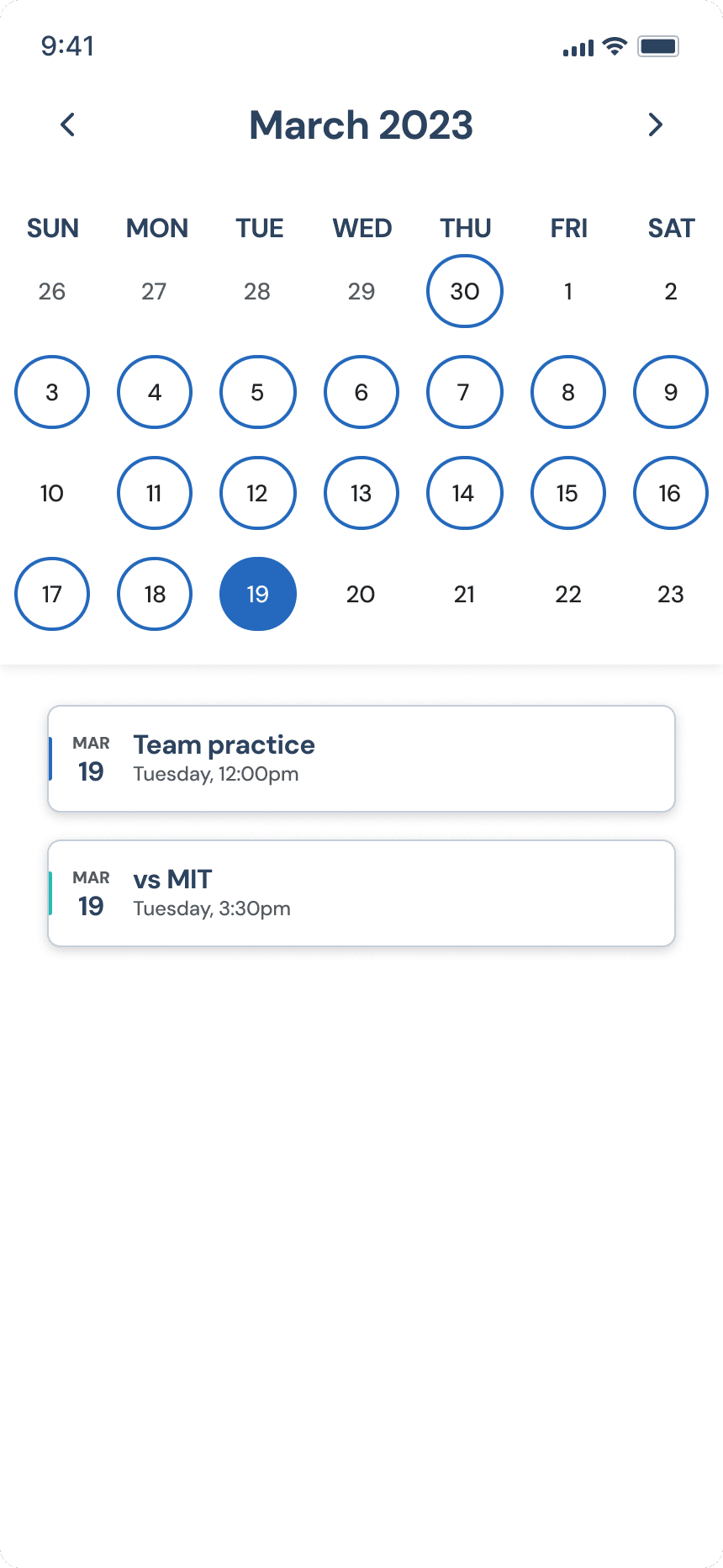
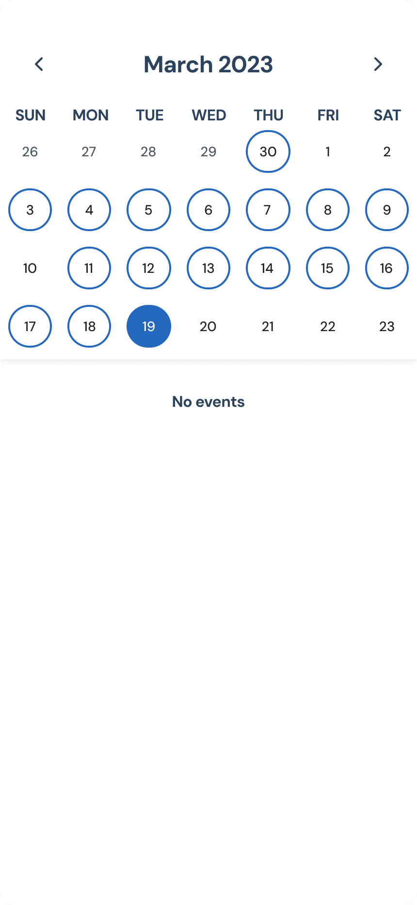
Calendar Exploration

Example of our iterative design process
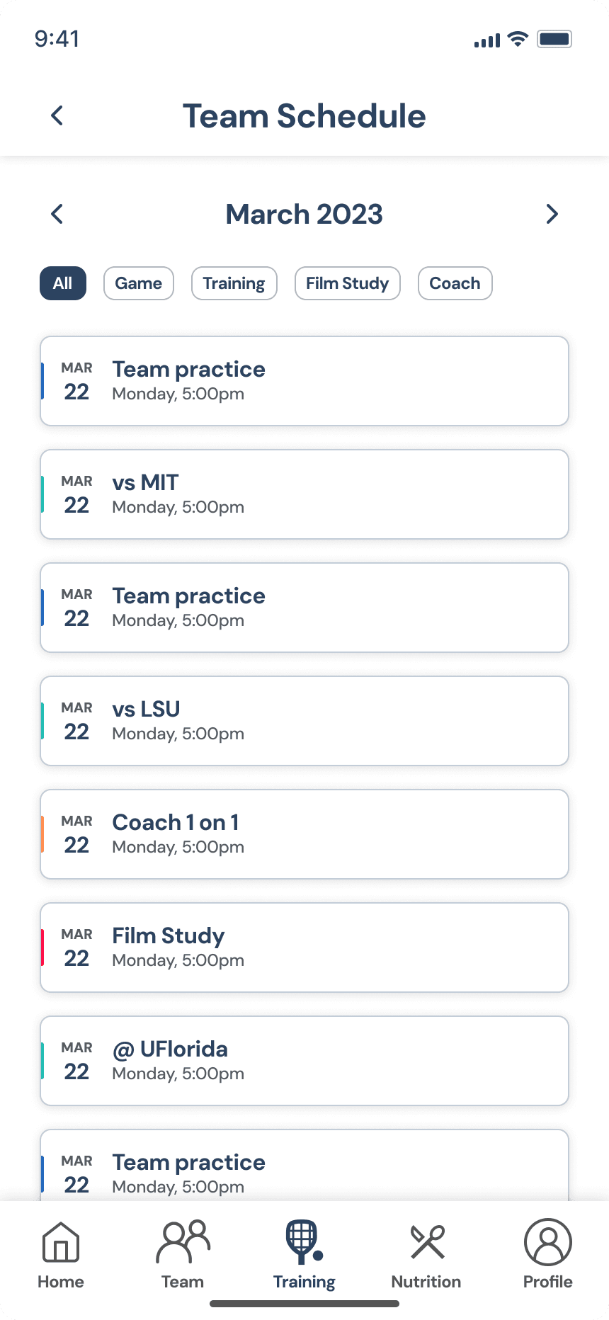
Monthly Schedule

Monthly Schedule

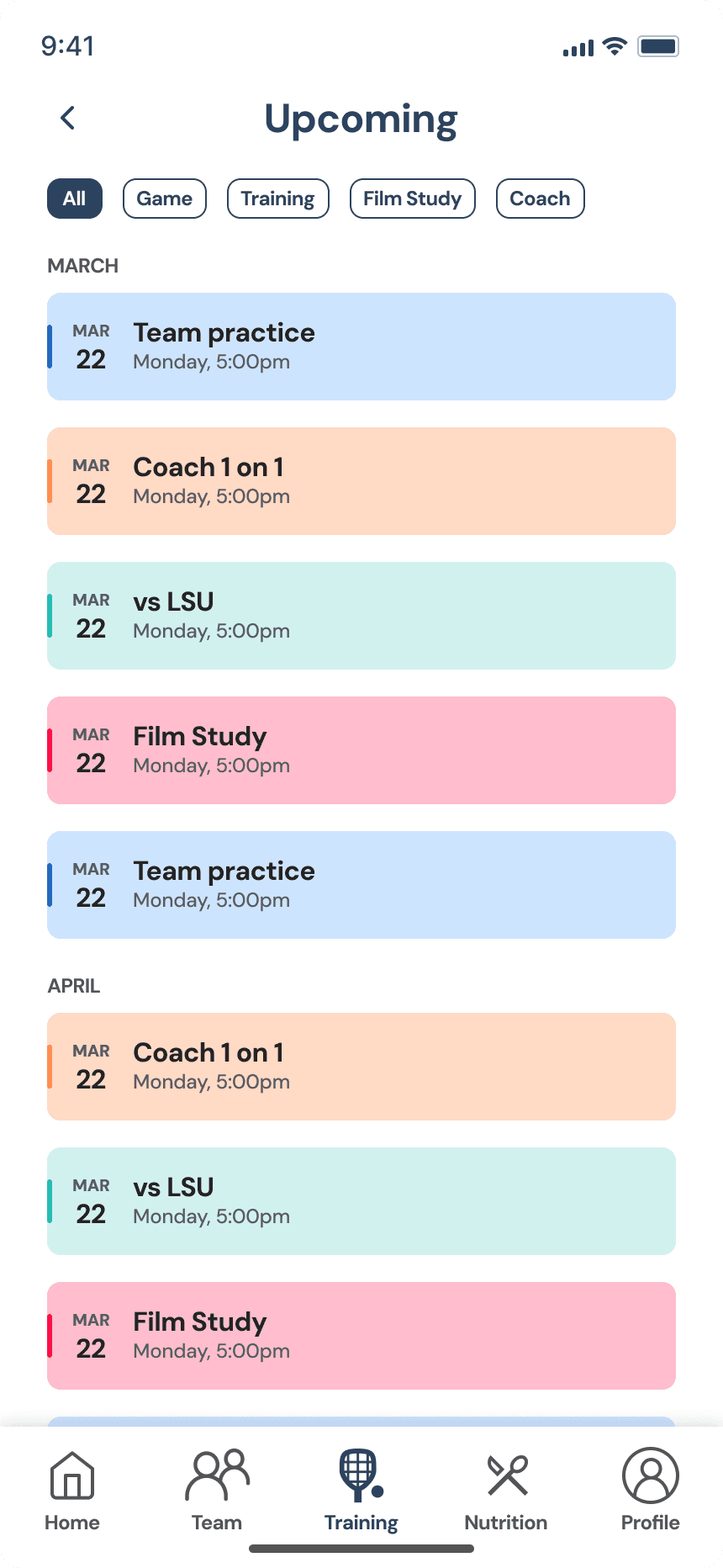
Upcoming

Upcoming

Upcoming v2
(colored)

Upcoming v2
(colored)

Calendar v2
(blue circle)

Calendar v2
(blue circle)

Calendar v2
(empty)

Calendar v2
(empty)

Calendar v3
(gray dot)

Calendar v3
(gray dot)

Mid Fidelity Screens

Example of our iterative design process
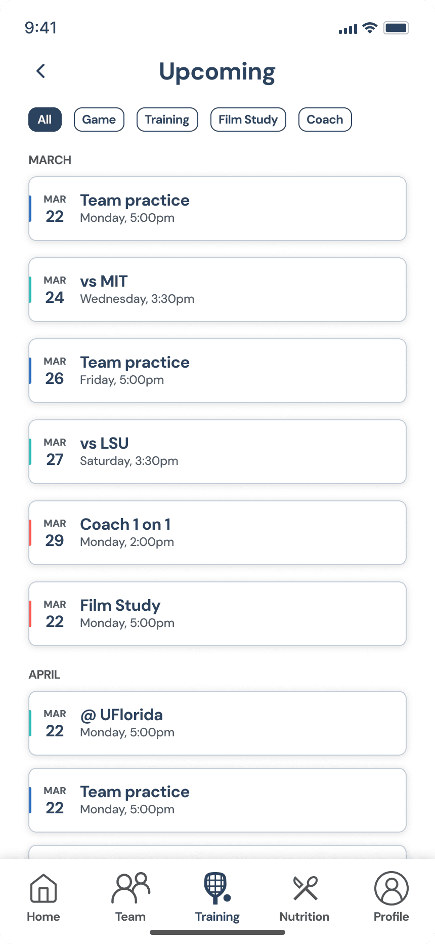
Team Hub

Posts

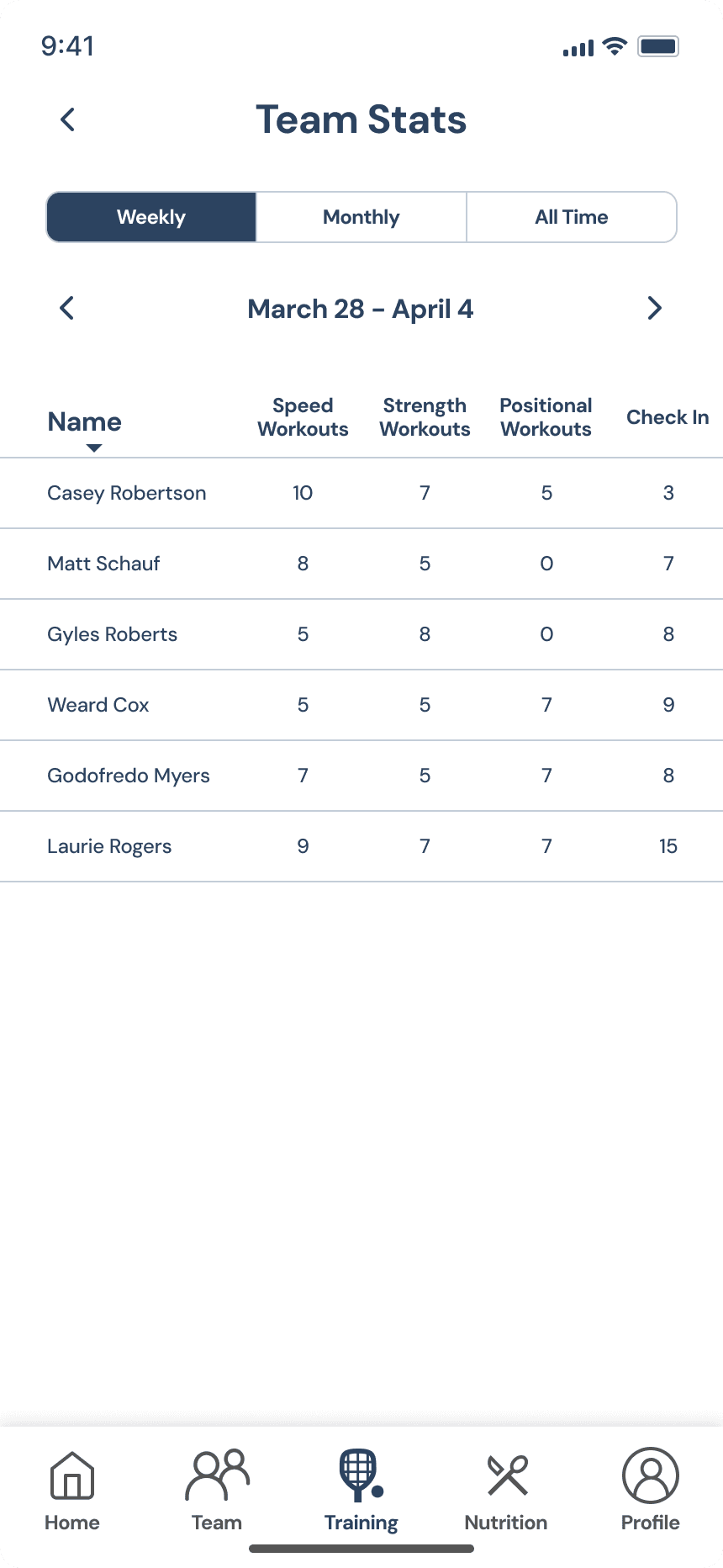
Team Stats

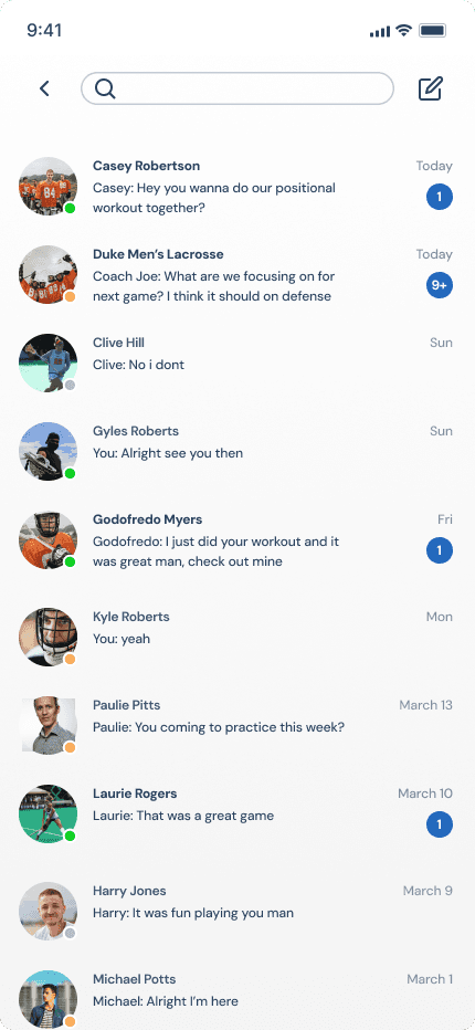
Messages

Store

Team Hub

Posts

Team Stats

Messages

Store

Team Hub

Posts

Team Stats

Messages

Store

Week 4: Final Redesign

Onboarding

  • Simple enough for all ages

  • Empty space to make process relaxed

  • One question at a time

  • Simple enough for all ages

  • Empty space to make process relaxed

  • One question at a time

  • Simple enough for all ages

  • Smooth and spacious UI

  • One question at a time

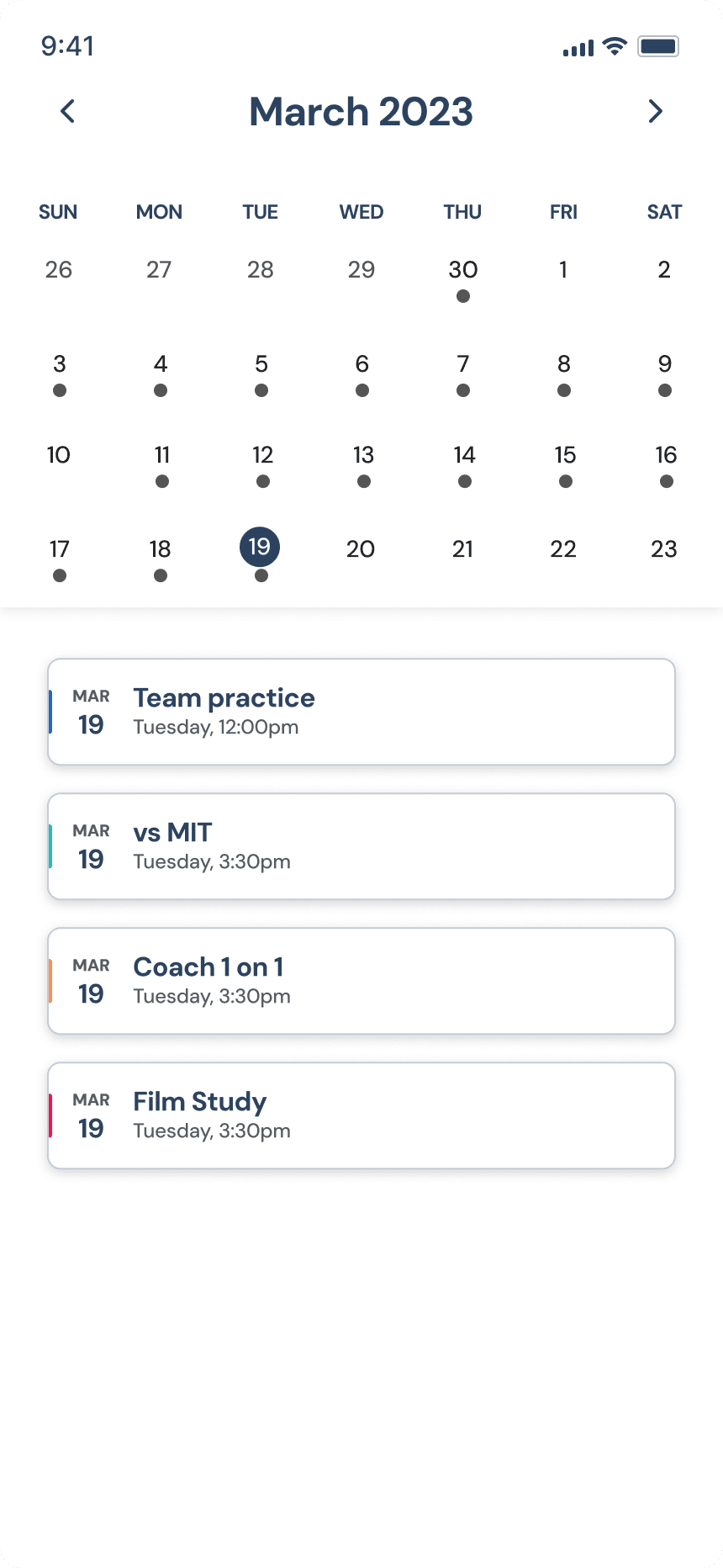
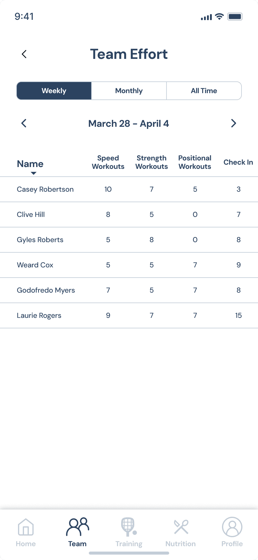
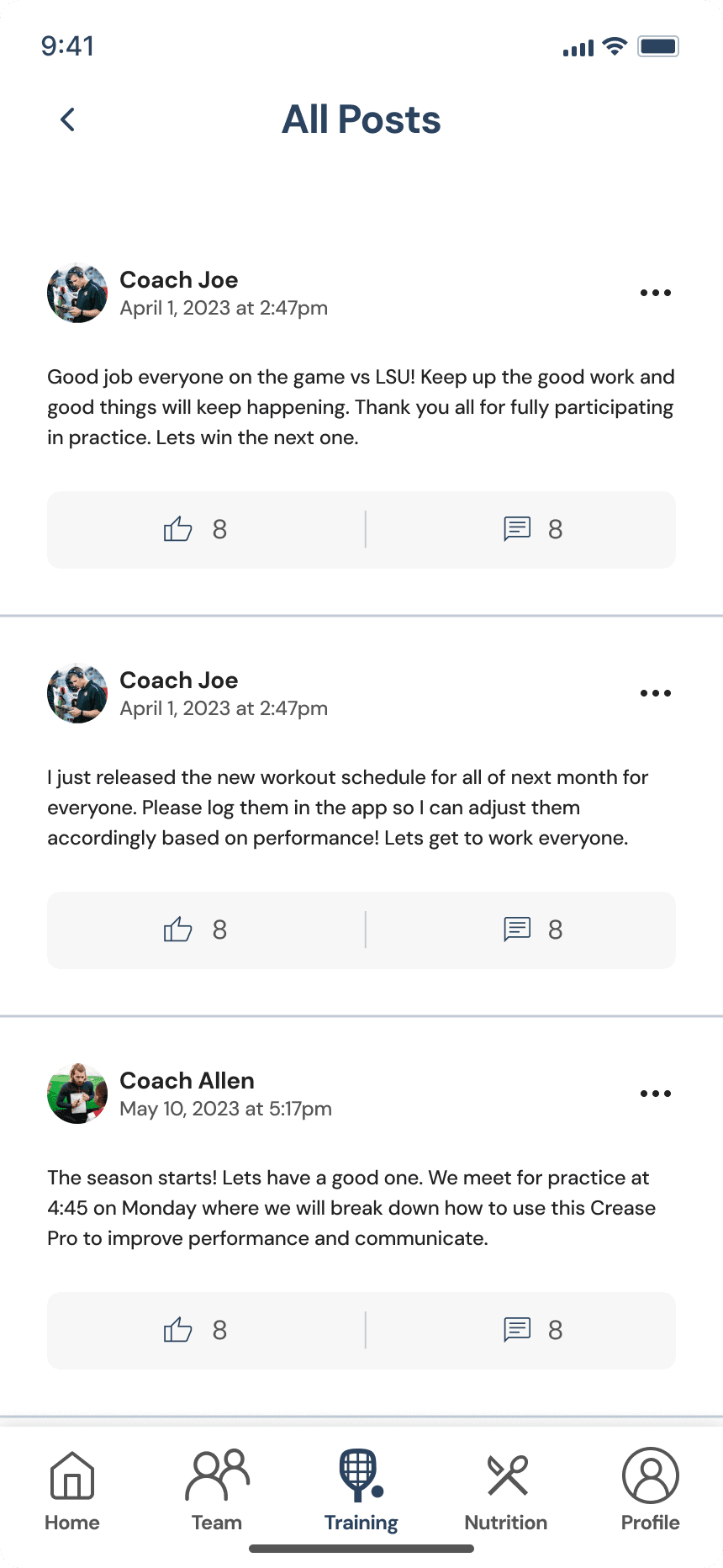
Organized team information (schedule, workouts, notices) is a simple yet extremely effective to boost usage.

Team Hub
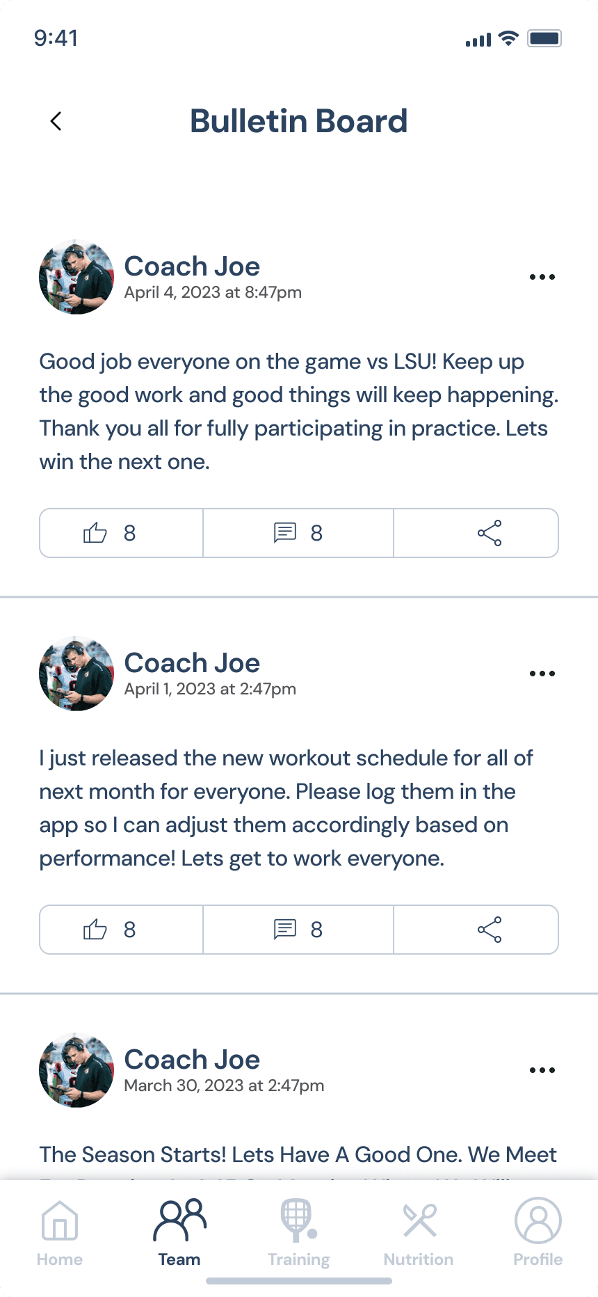
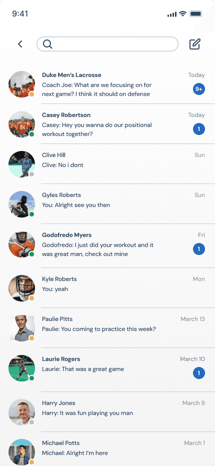
  • Center for team communications

  • Bulletin Board for team notices

  • Chat for teammates, coaches, other teams

  • Team workouts and schedule

  • Center for team communications

  • Bulletin Board for team notices

  • Chat for teammates, coaches, other teams

  • Team workouts and schedule

  • Center for team communication

  • Bulletin Board for team notices

  • Chat for teammates, coaches, other teams

  • Team workouts and schedule

Bulletin Board

Team Effort

Chat

Team Hub

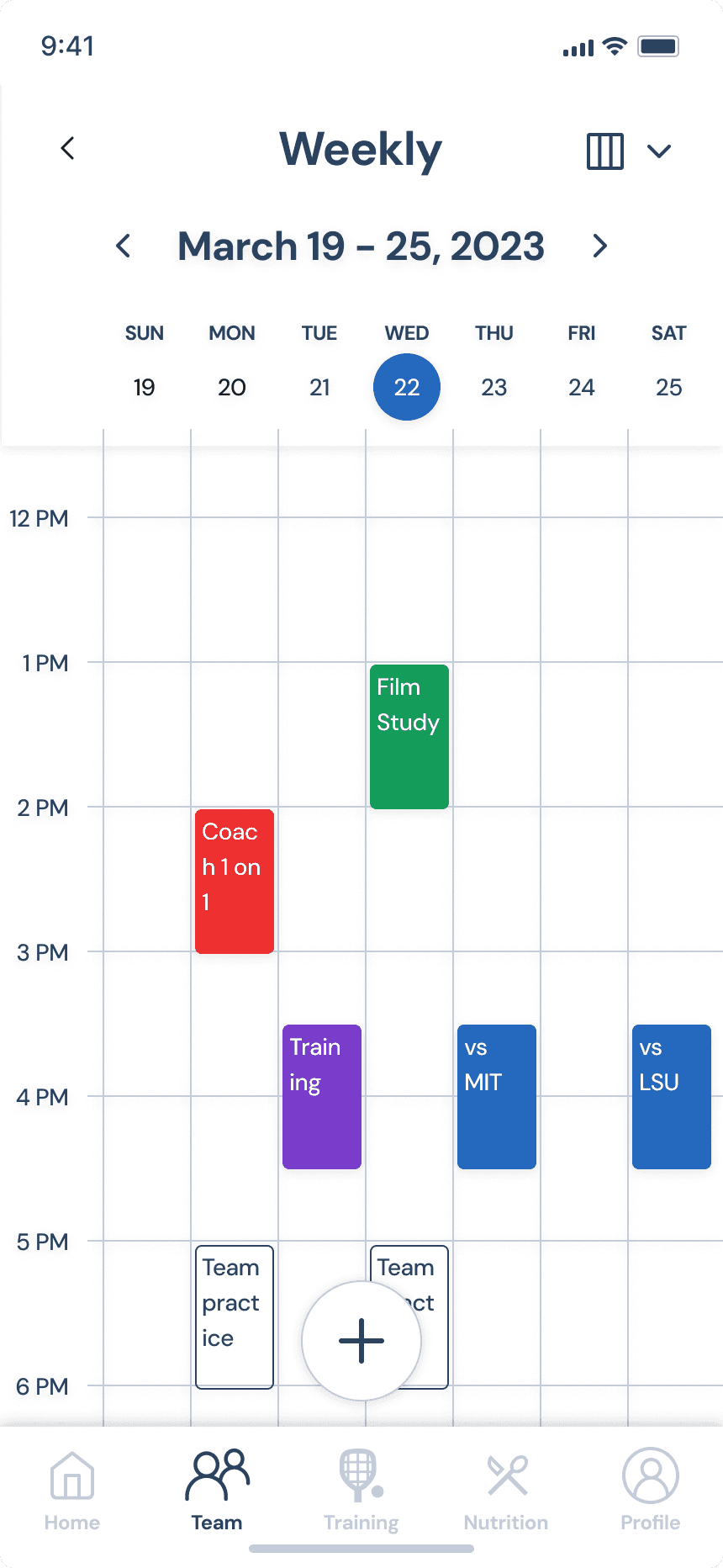
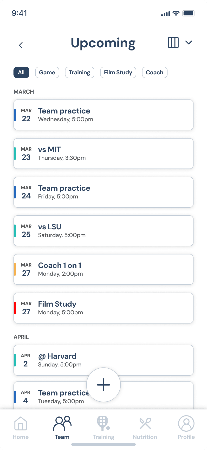
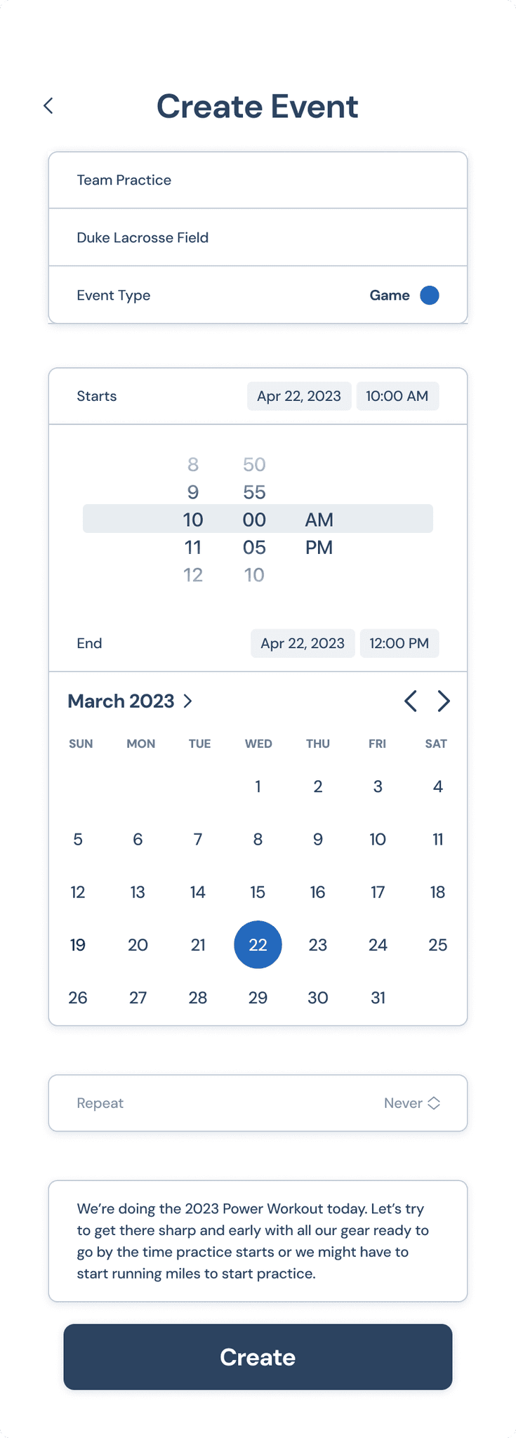
Schedule

Scheduling

  • Monthly, Weekly, Upcoming view

  • Simplify the often busy life of an athlete

  • Event categories for visual clarity and organization

  • Monthly, Weekly, Upcoming view

  • Simplify the often busy life of an athlete

  • Event categories for visual clarity and organization

  • Monthly, Weekly, Upcoming view

  • Simplify busy life of an athlete

  • Event categories for visual clarity and organization

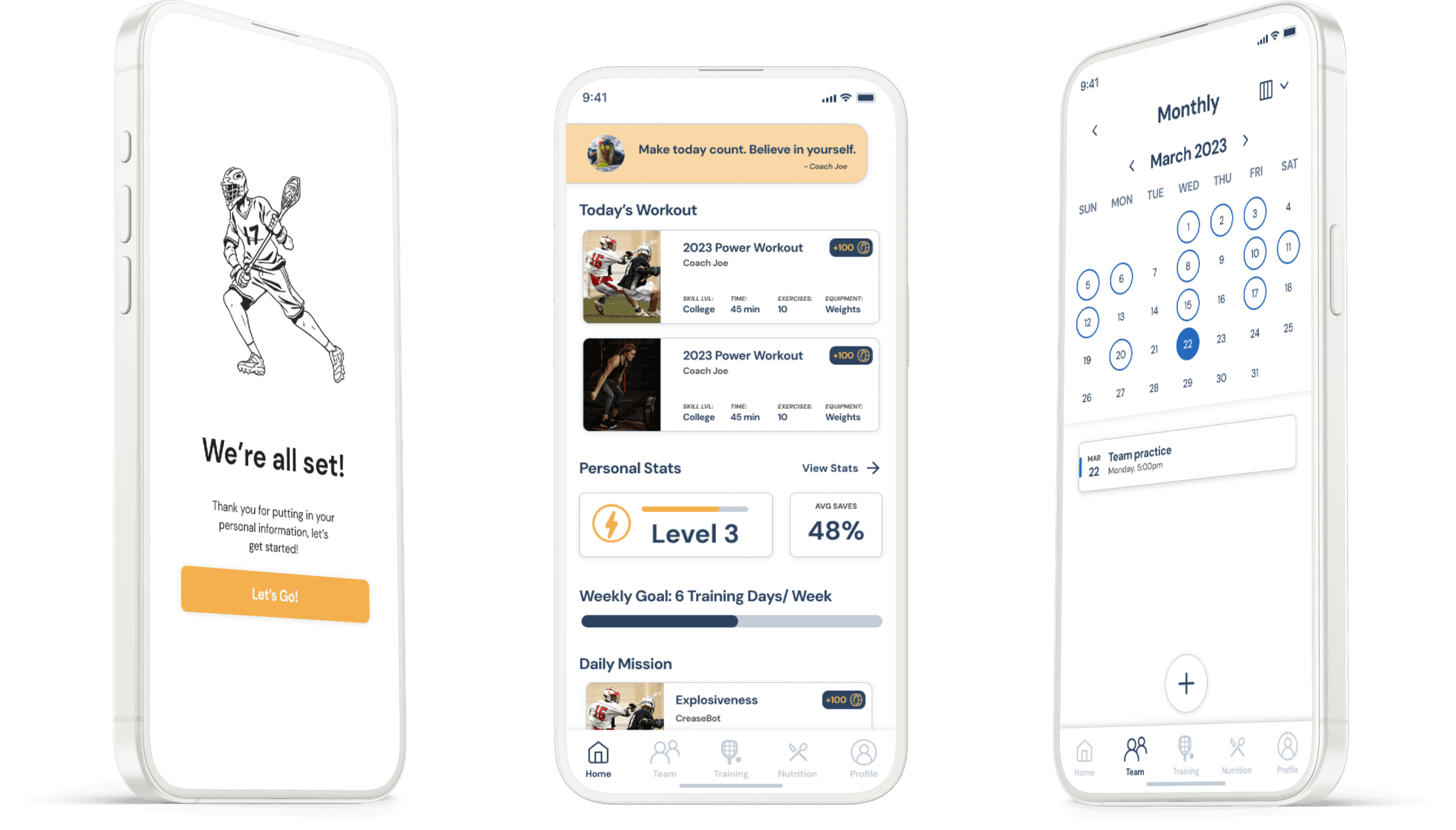
Monthly

Weekly

Upcoming

Create Event

Training Gif

  • Frictionless workout flow

  • Workout details provide info

  • Similar to music playlist

  • Frictionless workout flow

  • Workout details provide info

  • Similar to music playlist

Training

Training Gif

Training

Training Flow

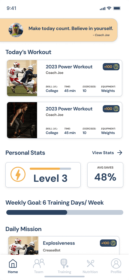
Homepage

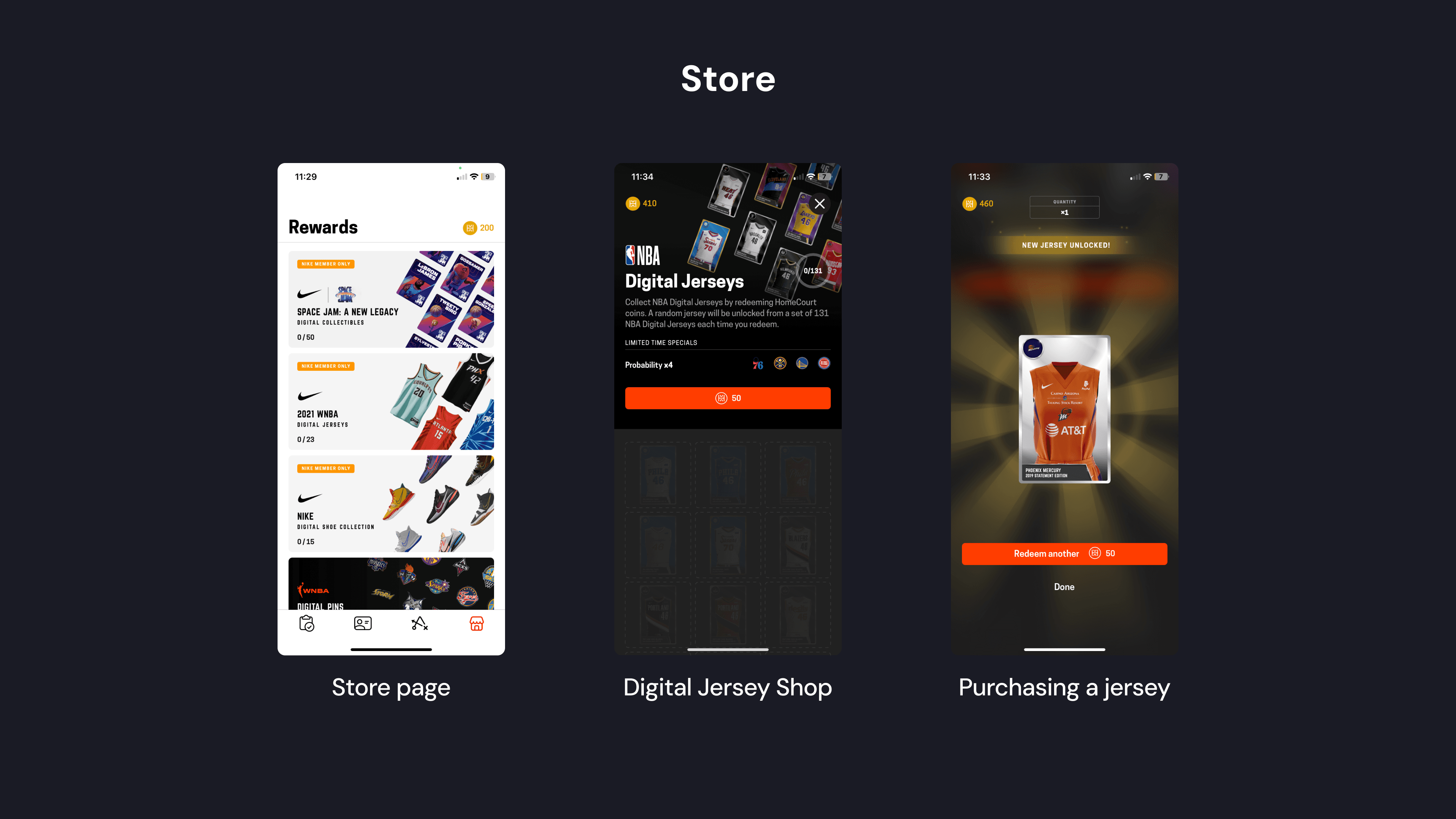
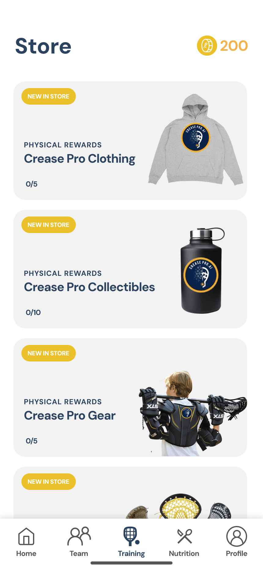
Gamifying workouts by earning coins and cashing in for rewards makes the product more engaging.
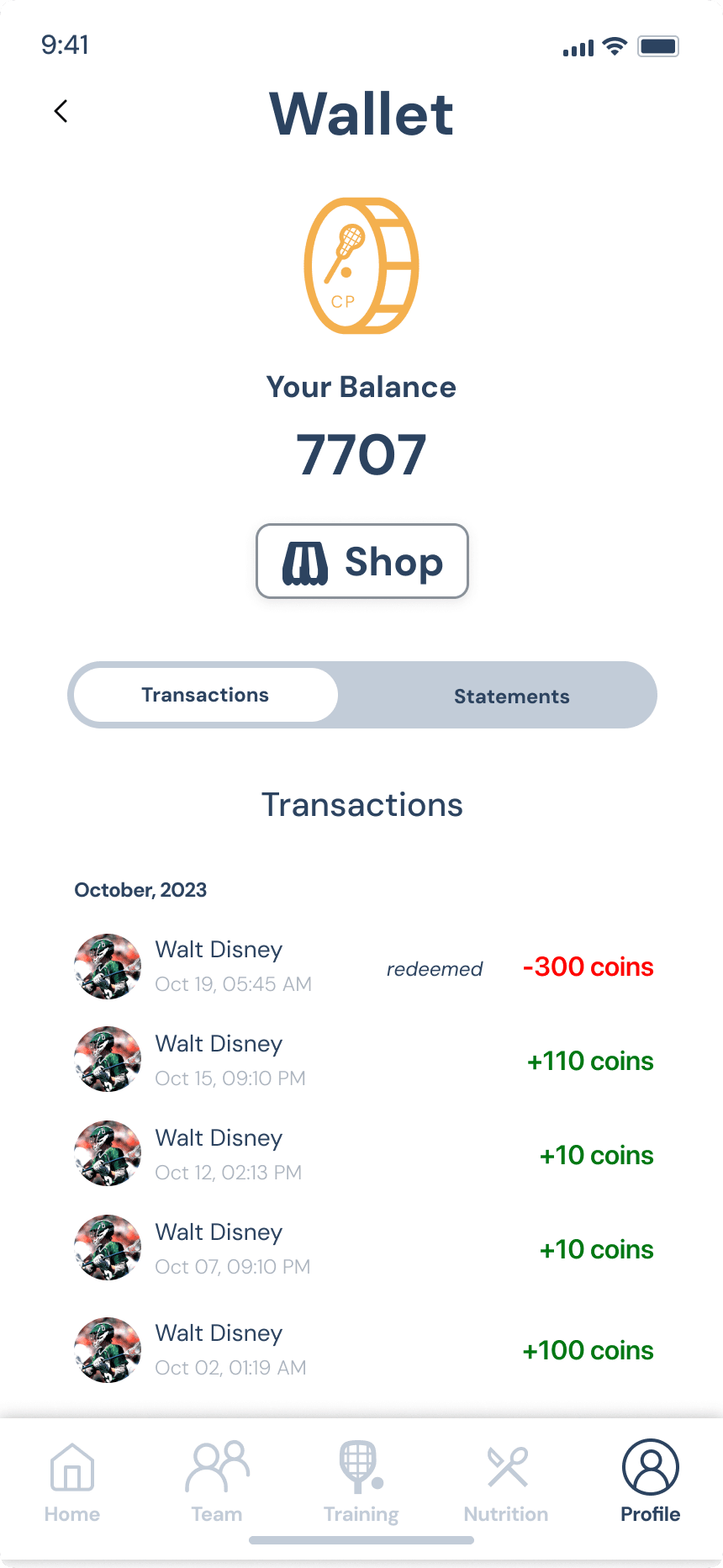
Wallet
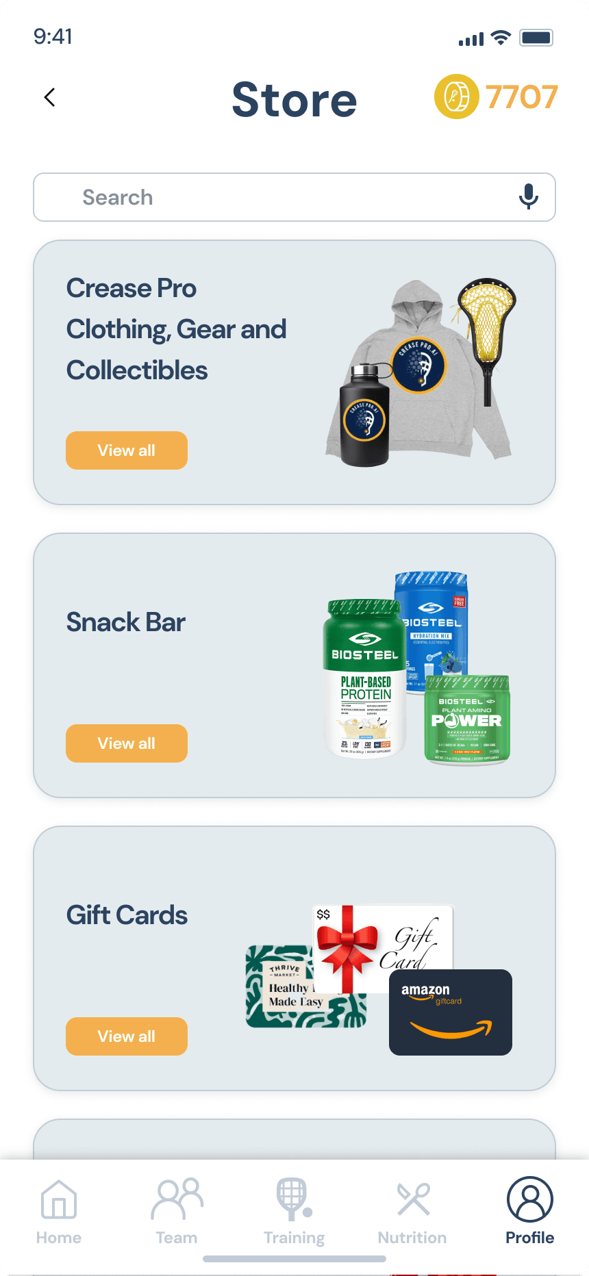
Store
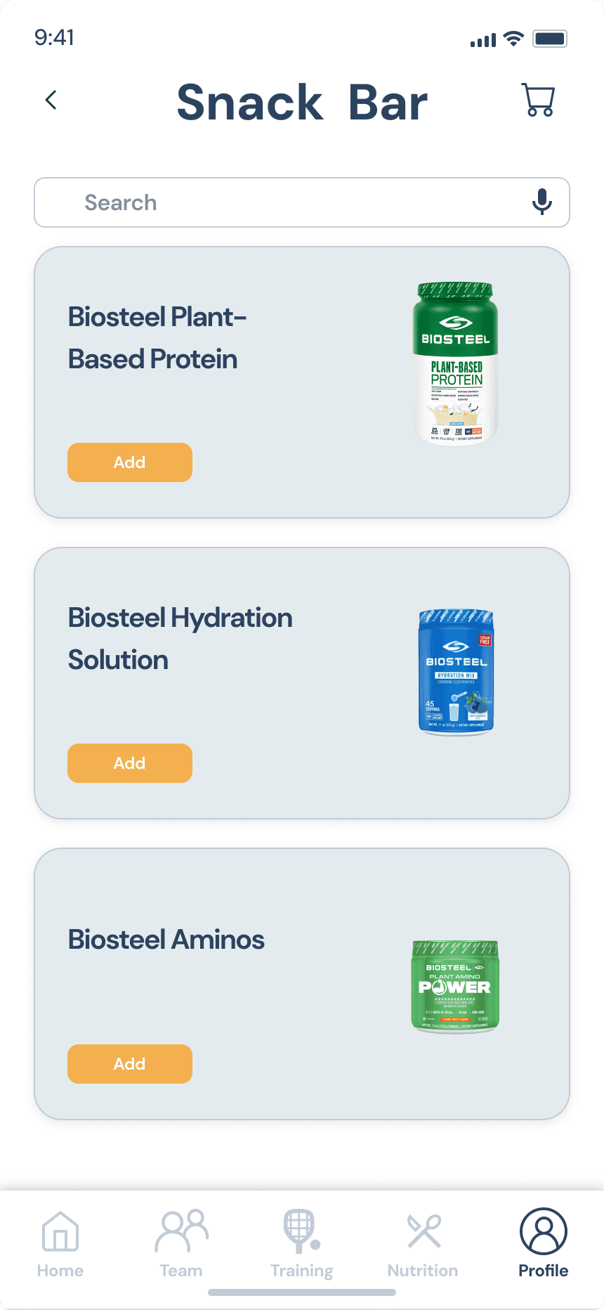
Snack Bar
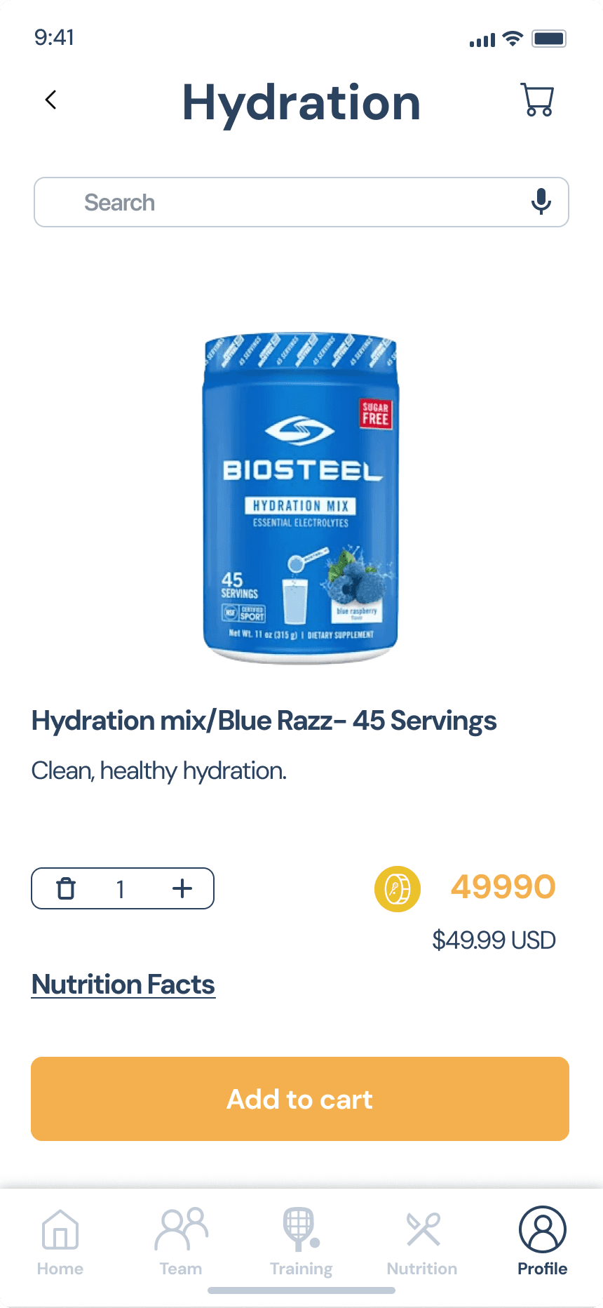
Item

Design System

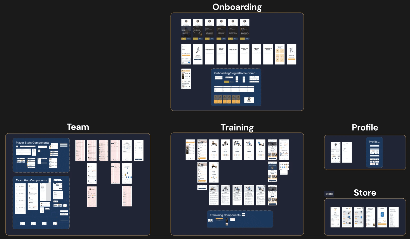
The system is based on the sitemap to be easily understood by stakeholders.

Final Site Map

Final Site Map

Designed Systems by Sections

Designed System by Sections

Designed System by Sections

Expanded Team Section

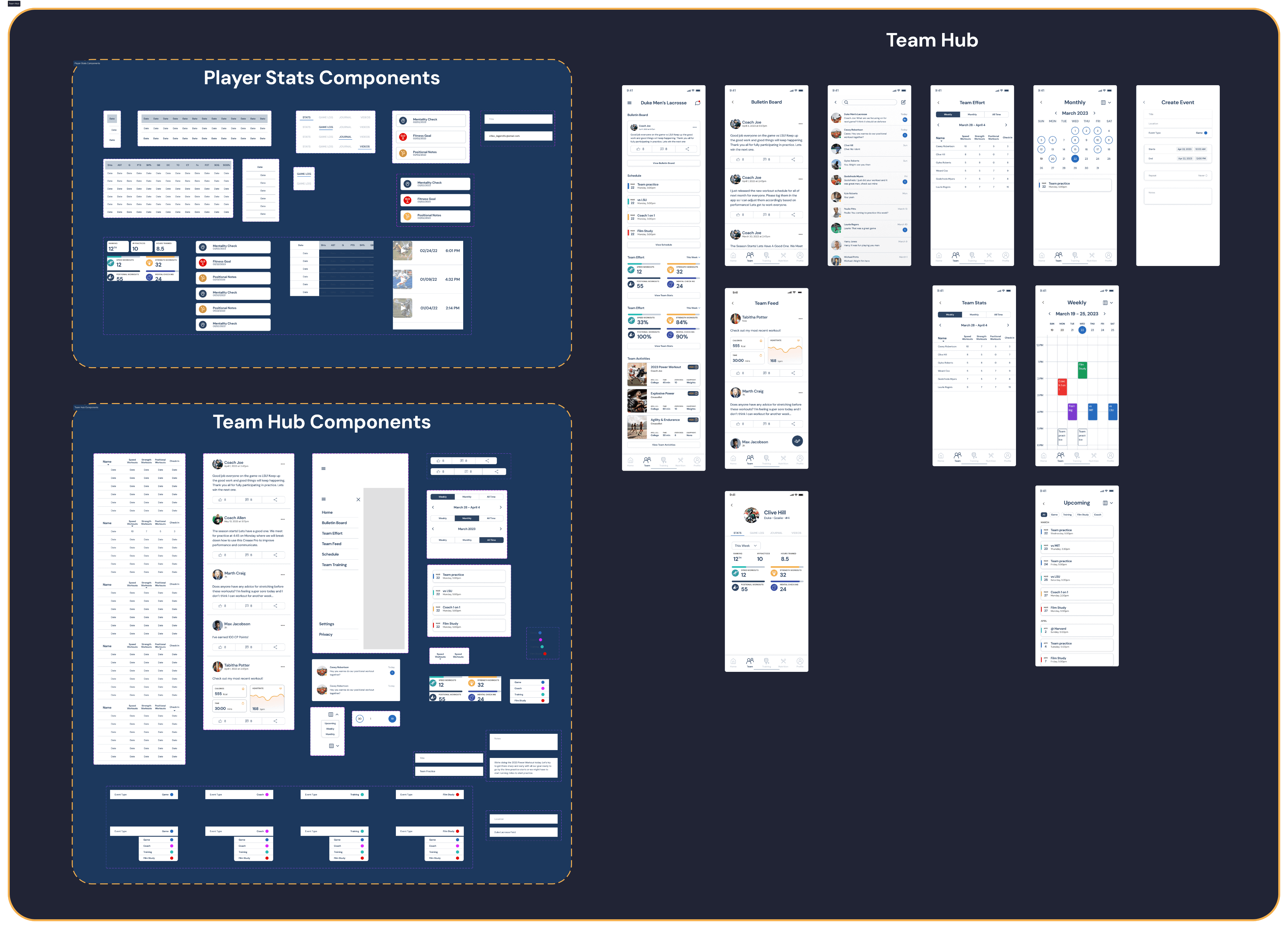
Components in the light blue sections (left) and screens (right)

Components in the light blue sections (left) and screens (right)

The design system has the components in sections to make and see changes made easier

The design system has the components beside screens for clarity and ease of use.

Wrap Up

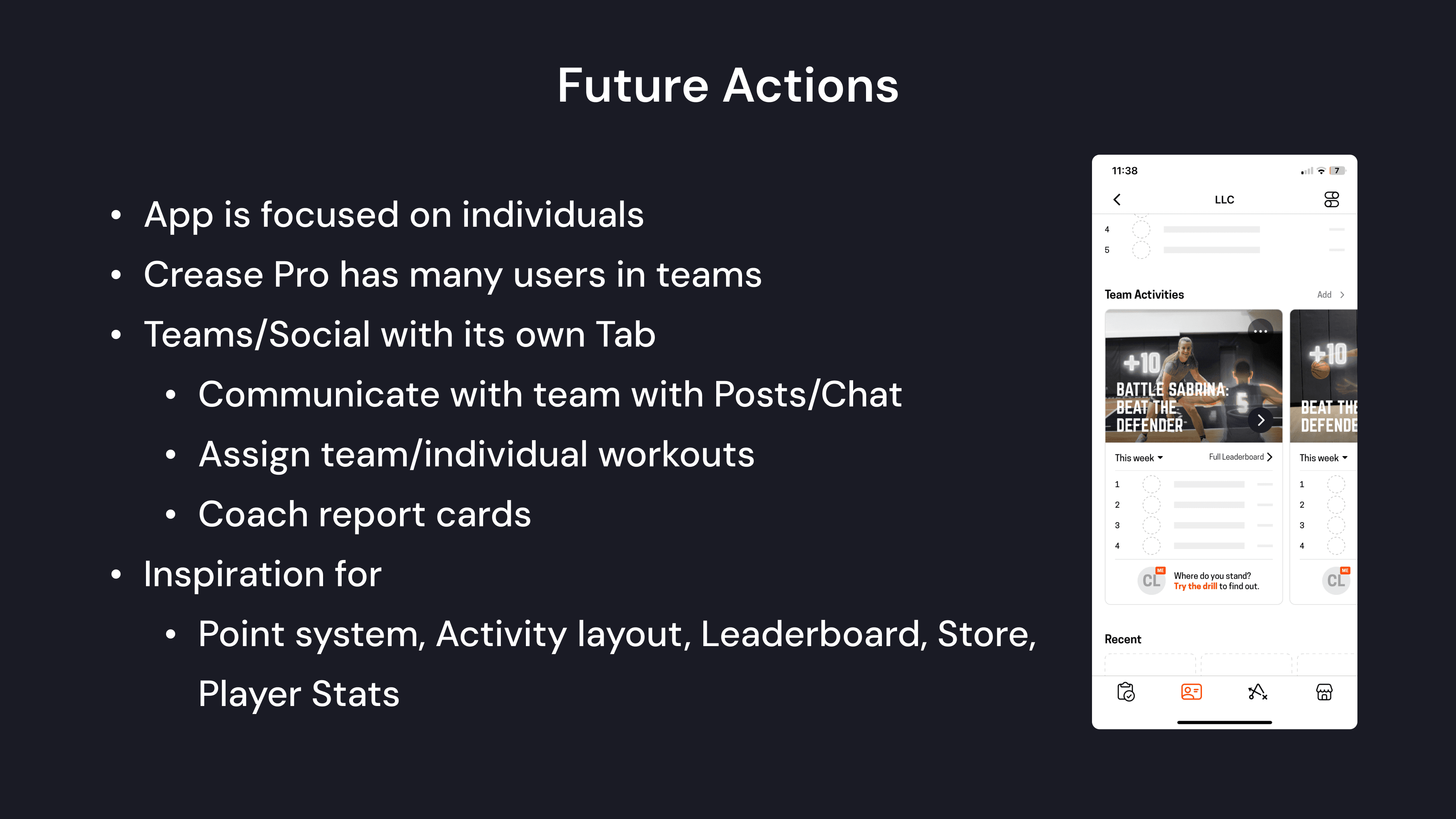
Future Actions

  1. Improve homepage layout and visual appeal

  2. Team Hub can be more functional and visually appealing

  3. Develop reward system further